Guest - Testers are needed for the reworked CDateTime core component. See... https://forum.kodi.tv/showthread.php?tid=378981 (September 29) x
  • 1
  • 210
  • 211
  • 212(current)
  • 213
  • 214
  • 299
Release Amber for Leia/Matrix/Nexus
(2021-06-26, 10:41)dawsonjw Wrote: Hi all
I asked a question a week or so back about being able to get information on actors etc from the info movie screen. Bart told me about enabling the embuary helper and themoviedb helper. I have done this and you can view actor details. I have also recently noticed by enabling these options there is now a new button to display Online TMDB info. Sometimes when you click this button a new screen loads with movie details but in 95% of the times you just get a quick flash of “loading” and then nothing happens.

Any ideas on what’s going on here?

Cheers

John

@dawsonjw, that button opens the tmdb media details provided by script.embuary.info.

Regards,

Bart
Amber Maintainer
Main HTPC: Intel Core i7, 32GB, nVidia GTX1080, Windows 11 Soundbar: Samsung HW-Q950A TV: LG CX Kodi: 19.3 Skin: Amber
Reply
(2021-06-26, 10:28)Cyberdom Wrote:
(2021-06-25, 23:55)bsoriano Wrote: Hello all,

I have uploaded versions 3.4.22 (Matrix) and 3.2.142 (Leia) to GitHub and the Amber repos.
Thank you @bsoriano for your speed in fixing the problems mentioned above.

However, I noticed other bugs.
With the compact OSD, when the poster is displayed and then the button is clicked to display the chapters dialog box (to select a chapter), the background of the compact OSD is transparent.
When you exit the chapters dialog, the background turns dark again. What would be nice is to make the compact OSD disappear when the chapters dialog is displayed.

With the ultra compact OSD, when you click Info button to display the plot and the poster, the background is transparent.
 
(2021-06-24, 21:19)bsoriano Wrote: I would like to know from as many of you as possible if you like the highlighting of the buttons in the compact OSD better than the regular block highlighting.  If I get more than 7 responses that you do, I will change it (not make it an option) in the standard and ultra compact OSDs.
I also like the idea of the highlighting of the buttons.
It would be nice to have the same buttons, the subtitles in bubble form and the i (for info) in circle form, in the standard OSD and ultra compact OSD.

@Cyberdom, thanks for reporting these. I will fix these soon. In regards to the buttons, I will make them consistent in all of the OSD variants, and I think I will go ahead and make it an option to choose standard or compact highlighting for the buttons.

I will work on these items over the next few days.

Regards,

Bart
Amber Maintainer
Main HTPC: Intel Core i7, 32GB, nVidia GTX1080, Windows 11 Soundbar: Samsung HW-Q950A TV: LG CX Kodi: 19.3 Skin: Amber
Reply
(2021-06-26, 21:55)bsoriano Wrote:
(2021-06-26, 10:28)Cyberdom Wrote:
(2021-06-25, 23:55)bsoriano Wrote: Hello all,

I have uploaded versions 3.4.22 (Matrix) and 3.2.142 (Leia) to GitHub and the Amber repos.
Thank you @bsoriano for your speed in fixing the problems mentioned above.

However, I noticed other bugs.
With the compact OSD, when the poster is displayed and then the button is clicked to display the chapters dialog box (to select a chapter), the background of the compact OSD is transparent.
When you exit the chapters dialog, the background turns dark again. What would be nice is to make the compact OSD disappear when the chapters dialog is displayed.

With the ultra compact OSD, when you click Info button to display the plot and the poster, the background is transparent.
 
(2021-06-24, 21:19)bsoriano Wrote: I would like to know from as many of you as possible if you like the highlighting of the buttons in the compact OSD better than the regular block highlighting.  If I get more than 7 responses that you do, I will change it (not make it an option) in the standard and ultra compact OSDs.
I also like the idea of the highlighting of the buttons.
It would be nice to have the same buttons, the subtitles in bubble form and the i (for info) in circle form, in the standard OSD and ultra compact OSD.

@Cyberdom, thanks for reporting these. I will fix these soon. In regards to the buttons, I will make them consistent in all of the OSD variants, and I think I will go ahead and make it an option to choose standard or compact highlighting for the buttons.

I will work on these items over the next few days.

Regards,

Bart
OK, thanks @bsoriano.
It's a good idea to create a new option to choose standard or compact highlighting for the buttons.
Reply
(2021-06-25, 23:55)bsoriano Wrote: I have uploaded versions 3.4.22 (Matrix) and 3.2.142 (Leia) to GitHub and the Amber repos.

This versions fix the issue of OSD buttons not being displayed for the Compact OSD.  It also displays poster/thumb for the Ultra Compact and Compact OSD (for the Compact OSD, the poster/thumb will only be shown if you press Info).  Also, it does not show the seek bar on pause for the Ultra Compact OSD, and does show it (at the top) when forwarding or rewinding with the Ultra Compact OSD. 

The UC-OSD is working perfectly with 3.4.22 installed, and I must say I absolutely love how it "shows" on screen.

Thank you @bsoriano for the work you have put in for all of us.
System 1: Ryzen 3400G, Gigabyte Mini ITX B450I - LibreELEC 11.x (Kodi 20 [Nexus]) - Skin: Amber (Matrix)
System 2: Khadas VIM3pro - CoreELEC- Skin: Amber (Matrix)

System 3: Ryzen 5700g Gigabyte Mini ITX x570 - LibreElec 12.x (Kodi 21 [Omega]) Nightlies - Skin: Aeon-Nox: Silvo (Omega)
Reply
(2021-06-26, 21:51)bsoriano Wrote:
(2021-06-26, 10:41)dawsonjw Wrote: Hi all
I asked a question a week or so back about being able to get information on actors etc from the info movie screen. Bart told me about enabling the embuary helper and themoviedb helper. I have done this and you can view actor details. I have also recently noticed by enabling these options there is now a new button to display Online TMDB info. Sometimes when you click this button a new screen loads with movie details but in 95% of the times you just get a quick flash of “loading” and then nothing happens.

Any ideas on what’s going on here?

Cheers

John

@dawsonjw, that button opens the tmdb media details provided by script.embuary.info.

Regards,

Bart

Hi Bart
So any ideas on why it just says loading at the bottom of the screen and then does nothing

I have uploaded the debug log here

HTTPS://paste.kodi.tv/ukajafexec

Any help would be appreciated

Cheers

John
Reply
(2021-06-25, 23:55)bsoriano Wrote: Hello all,

I have uploaded versions 3.4.22 (Matrix) and 3.2.142 (Leia) to GitHub and the Amber repos.

This versions fix the issue of OSD buttons not being displayed for the Compact OSD.  It also displays poster/thumb for the Ultra Compact and Compact OSD (for the Compact OSD, the poster/thumb will only be shown if you press Info).  Also, it does not show the seek bar on pause for the Ultra Compact OSD, and does show it (at the top) when forwarding or rewinding with the Ultra Compact OSD.  Finally, it fixes the issue of no background for the seek bar in the music OSD when using the Compact OSD.

@Cyberdom , @TheRealDeadMan , @lynxstrike , @FamShoppa , this should address the issues that all of you reported.  Please update, test, and let me know.  Thanks.

Regards,

Bart

Sorry for the late reply, but it's been chaos in Nvidia Shield land these last few days.
Just wanted to chime in that Amber's OSD looks very sleek & pretty now!
Thanks for going into over-time to add this late change!
Reply
(2021-06-27, 05:33)dawsonjw Wrote:
(2021-06-26, 21:51)bsoriano Wrote:
(2021-06-26, 10:41)dawsonjw Wrote: Hi all
I asked a question a week or so back about being able to get information on actors etc from the info movie screen. Bart told me about enabling the embuary helper and themoviedb helper. I have done this and you can view actor details. I have also recently noticed by enabling these options there is now a new button to display Online TMDB info. Sometimes when you click this button a new screen loads with movie details but in 95% of the times you just get a quick flash of “loading” and then nothing happens.

Any ideas on what’s going on here?

Cheers

John

@dawsonjw, that button opens the tmdb media details provided by script.embuary.info.

Regards,

Bart

Hi Bart
So any ideas on why it just says loading at the bottom of the screen and then does nothing

I have uploaded the debug log here

HTTPS://paste.kodi.tv/ukajafexec

Any help would be appreciated

Cheers

John
@dawsonjw , I di not see any error in the log that might point to what the issue is.  Do you have a recent version of script.embuary.info? I am using version 2.0.8 in Matrix 19.1 under Windows.  That version is the one from the Kodi repo.

Regards,

Bart
Amber Maintainer
Main HTPC: Intel Core i7, 32GB, nVidia GTX1080, Windows 11 Soundbar: Samsung HW-Q950A TV: LG CX Kodi: 19.3 Skin: Amber
Reply
(2021-06-26, 10:28)Cyberdom Wrote:
(2021-06-25, 23:55)bsoriano Wrote: Hello all,

I have uploaded versions 3.4.22 (Matrix) and 3.2.142 (Leia) to GitHub and the Amber repos.
Thank you @bsoriano for your speed in fixing the problems mentioned above.

However, I noticed other bugs.
With the compact OSD, when the poster is displayed and then the button is clicked to display the chapters dialog box (to select a chapter), the background of the compact OSD is transparent.
When you exit the chapters dialog, the background turns dark again. What would be nice is to make the compact OSD disappear when the chapters dialog is displayed.

With the ultra compact OSD, when you click Info button to display the plot and the poster, the background is transparent.
 
(2021-06-24, 21:19)bsoriano Wrote: I would like to know from as many of you as possible if you like the highlighting of the buttons in the compact OSD better than the regular block highlighting.  If I get more than 7 responses that you do, I will change it (not make it an option) in the standard and ultra compact OSDs.
I also like the idea of the highlighting of the buttons.
It would be nice to have the same buttons, the subtitles in bubble form and the i (for info) in circle form, in the standard OSD and ultra compact OSD.
@Cyberdom , just to let you know I found  the first issue you mentioned, but I could not replicate the second issue.  Please post a screenshot of that so I can better understand what is going on.  Thanks.

Regards,

Bart
Amber Maintainer
Main HTPC: Intel Core i7, 32GB, nVidia GTX1080, Windows 11 Soundbar: Samsung HW-Q950A TV: LG CX Kodi: 19.3 Skin: Amber
Reply
(2021-06-28, 21:18)bsoriano Wrote:
(2021-06-26, 10:28)Cyberdom Wrote:
(2021-06-25, 23:55)bsoriano Wrote: Hello all,

I have uploaded versions 3.4.22 (Matrix) and 3.2.142 (Leia) to GitHub and the Amber repos.
Thank you @bsoriano for your speed in fixing the problems mentioned above.

However, I noticed other bugs.
With the compact OSD, when the poster is displayed and then the button is clicked to display the chapters dialog box (to select a chapter), the background of the compact OSD is transparent.
When you exit the chapters dialog, the background turns dark again. What would be nice is to make the compact OSD disappear when the chapters dialog is displayed.

With the ultra compact OSD, when you click Info button to display the plot and the poster, the background is transparent.
 
(2021-06-24, 21:19)bsoriano Wrote: I would like to know from as many of you as possible if you like the highlighting of the buttons in the compact OSD better than the regular block highlighting.  If I get more than 7 responses that you do, I will change it (not make it an option) in the standard and ultra compact OSDs.
I also like the idea of the highlighting of the buttons.
It would be nice to have the same buttons, the subtitles in bubble form and the i (for info) in circle form, in the standard OSD and ultra compact OSD.
@Cyberdom , just to let you know I found  the first issue you mentioned, but I could not replicate the second issue.  Please post a screenshot of that so I can better understand what is going on.  Thanks.

Regards,

Bart
Thank you @bsoriano for solving the first problem.

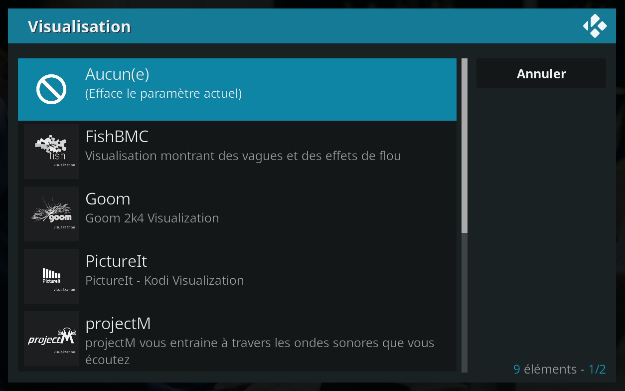
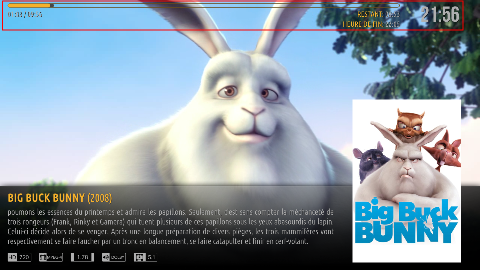
For the second problem, when the ultra compact OSD is activated, the background of the seek bar is transparent :
- When I press the Info button on my remote :
Image
- When I pause the video:
Image

I noticed another bug with the seek bar. I have enabled "Hide seek bar when paused" but when I pause the video, the seek bar remains displayed.
Reply
(2021-06-28, 22:42)Cyberdom Wrote:
(2021-06-28, 21:18)bsoriano Wrote:
(2021-06-26, 10:28)Cyberdom Wrote: Thank you @bsoriano for your speed in fixing the problems mentioned above.

However, I noticed other bugs.
With the compact OSD, when the poster is displayed and then the button is clicked to display the chapters dialog box (to select a chapter), the background of the compact OSD is transparent.
When you exit the chapters dialog, the background turns dark again. What would be nice is to make the compact OSD disappear when the chapters dialog is displayed.

With the ultra compact OSD, when you click Info button to display the plot and the poster, the background is transparent.
 
I also like the idea of the highlighting of the buttons.
It would be nice to have the same buttons, the subtitles in bubble form and the i (for info) in circle form, in the standard OSD and ultra compact OSD.
@Cyberdom , just to let you know I found  the first issue you mentioned, but I could not replicate the second issue.  Please post a screenshot of that so I can better understand what is going on.  Thanks.

Regards,

Bart
Thank you @bsoriano for solving the first problem.

For the second problem, when the ultra compact OSD is activated, the background of the seek bar is transparent :
- When I press the Info button on my remote :
Image
- When I pause the video:
Image

I noticed another bug with the seek bar. I have enabled "Hide seek bar when paused" but when I pause the video, the seek bar remains displayed.
@Cyberdom , thanks for the clarification.  I will fix those issues soon.

Regards,

Bart
Amber Maintainer
Main HTPC: Intel Core i7, 32GB, nVidia GTX1080, Windows 11 Soundbar: Samsung HW-Q950A TV: LG CX Kodi: 19.3 Skin: Amber
Reply
(2021-06-28, 19:01)bsoriano Wrote:
(2021-06-27, 05:33)dawsonjw Wrote:
(2021-06-26, 21:51)bsoriano Wrote: @dawsonjw, that button opens the tmdb media details provided by script.embuary.info.

Regards,

Bart

Hi Bart
So any ideas on why it just says loading at the bottom of the screen and then does nothing

I have uploaded the debug log here

HTTPS://paste.kodi.tv/ukajafexec

Any help would be appreciated

Cheers

John
@dawsonjw , I di not see any error in the log that might point to what the issue is.  Do you have a recent version of script.embuary.info? I am using version 2.0.8 in Matrix 19.1 under Windows.  That version is the one from the Kodi repo.

Regards,

Bart

Hi Bart
Yes I have the same versions here. Must be a mystery of life thing. Thanks for looking anyways as I know you are very busy. We all truly appreciate your efforts

Cheers

John
Reply
(2021-06-29, 00:53)bsoriano Wrote:
(2021-06-28, 22:42)Cyberdom Wrote:
(2021-06-28, 21:18)bsoriano Wrote: @Cyberdom , just to let you know I found  the first issue you mentioned, but I could not replicate the second issue.  Please post a screenshot of that so I can better understand what is going on.  Thanks.

Regards,

Bart
Thank you @bsoriano for solving the first problem.

For the second problem, when the ultra compact OSD is activated, the background of the seek bar is transparent :
- When I press the Info button on my remote :
Image
- When I pause the video:
Image

I noticed another bug with the seek bar. I have enabled "Hide seek bar when paused" but when I pause the video, the seek bar remains displayed.
@Cyberdom , thanks for the clarification.  I will fix those issues soon.

Regards,

Bart
OK, thank you @bsoriano.
Reply
Hello all,

I have uploaded versions 3.4.23 (Matrix) and 3.2.143 (Leia) to GitHub and the Amber repos.  The main change, besides bug fixing, is the following:

1. Alternate Highlighting option for OSD buttons.  The highlighting and button style intorduced with the Compact OSD is now an option, which means it can be used with any of the 3 OSD layouts.  You will find the new setting here:

Image

And this means that now, the ultra compact OSD can look like this:

Image

And the standard OSD can look like this:

Image

@Cyberdom , I think I also fixed the issue of the seekbar transparent background that you reported.  Please note that when you press Info (not the button on the OSD) while playing media, the seek bar will not hide, independently of the setting to Hide the seek bar on pause.  Thanks.

Please update, test, and let me know if you find any issues.  Thanks.

Regards,

Bart
Amber Maintainer
Main HTPC: Intel Core i7, 32GB, nVidia GTX1080, Windows 11 Soundbar: Samsung HW-Q950A TV: LG CX Kodi: 19.3 Skin: Amber
Reply
Hi Bart!

Here would be those missing finnish translations.

1. High = Korkea

These next few are related to the bottom shortcuts functionality:

2. Customize Bottom Shortcuts = Mukauta Pohjan Pikakuvakkeita
3. Shortcuts    = Pikakuvakkeet
4. Enable Bottom Shortcuts    = Ota Käyttöön Pohjan Pikakuvakkeet
5. Show Bottom Shortcuts for this Menu Item = Näytä Tämän Valikkokohdan Alimmat Pikakuvakkeet
6. Show Dark Background Behind Shortcuts  =  Näytä Tumma Tausta Pikakuvakkeiden Takana

7. Short Daily Weather    = Lyhyt Päivittäinen Sää
8. Short Hourly Weather    = Lyhyt Tunneittainen Sää

These next few are related to the Surprise Me functionality:

9. Surprise Me    = Yllätä Minut
10. Surprise Me (Movie)    = Yllätä Minut (Elokuva)
11. Surprise Me (Episode)    = Yllätä Minut (Jakso)
12. Surprise Me (Music Video)    = Yllätä Minut (Musiikkivideo)

Related to the Default Menu Item functionality:

13. Make Default Menu Item    = Tee Oletusvalikkokohta
14. Current Default Menu Item    = Nykyinen Oletusvalikkokohta

15. Show Item Name in Top Bar  = Näytä Kohteen Nimi Yläpalkissa
16. Ratings    = Arvosanat
17. IMDb Top 250    = IMDb Top 250

Related to the Logo and Fanart view types:

18. Use Clear Art instead of Logo    = Käytä Selkeää Taidetta Logon sijaan
19. Single Logo    = Yksittäinen Logo
20. Fade out Unfocused    = Häivytä Keskittämätön
21. Show Overlay = Näytä Päällys
22. Show Title in Footer = Näytä Otsikko Alatunnisteessa

23. Single Column    = Yksittäinen Sarake
24. Pause Media While Info Dialog is Open    = Keskeytä Media, Kun Info-valintaikkuna on Avoin
25. Activate Lyrics    = Aktivoi Sanoitukset

Related to searches within plot:

26. Movies with Plot containing    = Elokuvat, joiden juoni sisältää
27. TV Shows with Plot containing    = TV-Ohjelmat, joiden juoni sisältää
28. Episodes with Plot containing    = Jaksot, joiden juoni sisältää
29. With Plot Containing    = Juoni sisältäen

30. Items to Show in Views    = Näkymissä Näytettävät Kohteet
31. Play Random    = Toista Satunnainen
32. Select View Types to Enable    = Valitse Käytettävät Näkymät

Related to the Right List view:
​​​​​​​
33. Right List = Oikea Lista
34. Show Poster    = Näytä Juliste
35. Text    = Teksti
36. Banner    = Banneri
37. List Item Type = Listakohteen Tyyppi
38. N/A = Ei Saatavilla
39. Show Info Popup    = Näytä Info-ponnahdusikkuna
40. Popup Delay    = Ponnahdusikkunan Viive
41. Show Floor    = Näytä Kerros
42. Fixed List = Kiinteä Lista

43. OSD/Full Screen Art = OSD/Koko Näytön Taide
44. Poster/Thumb    = Juliste/Pikkukuva
45. Centered Static Menu (less than 8 items) = Keskitetty Liikkumaton Valikko (alle 8 kohdetta)

These are missing translations aswell on amber settings;

46. Compact OSD = Kompakti OSD
47. Ultra Compact OSD = Erittäin Kompakti OSD
48. Alternate OSD Button Highlighting = Vaihtoehtoinen OSD Painikkeen Korostus
Reply
(2021-06-29, 21:58)bsoriano Wrote: Hello all,

I have uploaded versions 3.4.23 (Matrix) and 3.2.143 (Leia) to GitHub and the Amber repos.  The main change, besides bug fixing, is the following:

1. Alternate Highlighting option for OSD buttons.  The highlighting and button style intorduced with the Compact OSD is now an option, which means it can be used with any of the 3 OSD layouts.  You will find the new setting here:

Image
Thank you @bsoriano for this update.

Here is the French translation for the new OSD button highlight feature :
Alternate OSD button highlighting : Surbrillance alternative des boutons de l'OSD
(2021-06-29, 21:58)bsoriano Wrote: @Cyberdom , I think I also fixed the issue of the seekbar transparent background that you reported.  Please note that when you press Info (not the button on the OSD) while playing media, the seek bar will not hide, independently of the setting to Hide the seek bar on pause.  Thanks.

Please update, test, and let me know if you find any issues.  Thanks.

Regards,

Bart
Seek bar background display bugs seem to be fixed.

On the other hand, the seek bar always remains displayed when I press the pause key.

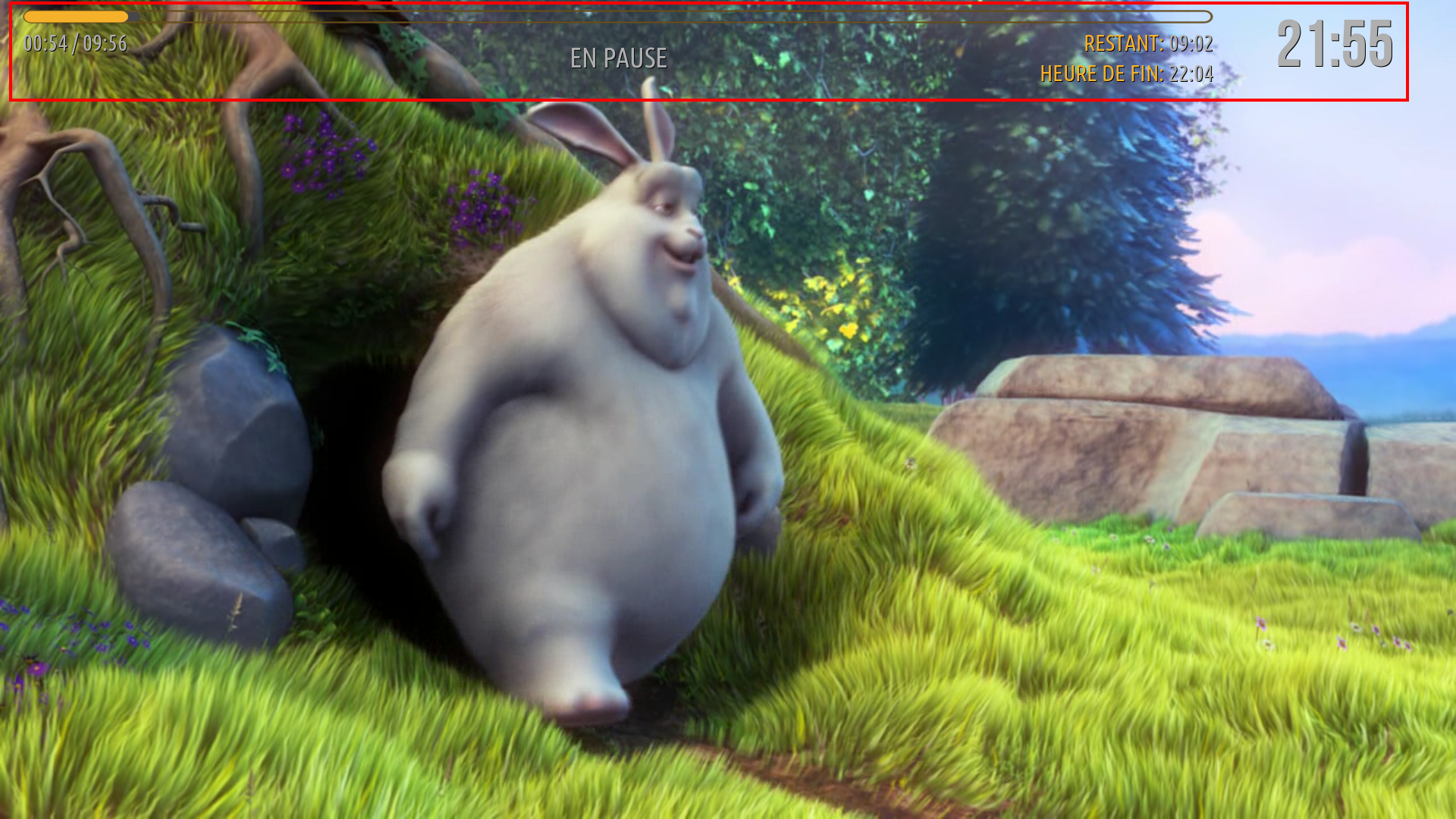
I noticed some changes to be made in the music part :
- In the music OSD, when listening to a song. By clicking on the settings icon, this pop-up is displayed :
Image
For fanart, you should put "Activated" instead of "Activate".
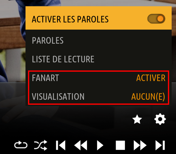
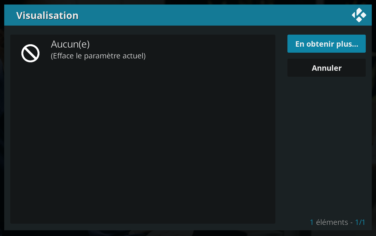
By clicking on "Visualisation", no pop-up opens and the music OSD closes.

With Esturay, by clicking on "Visualisation", a pop-up opens to choose a visualization or get more :
Image
Image

- On the home, in the display of the now playing of a song, an "S" should be added to "BIT" :
Image

Thanks in advance.
Reply
  • 1
  • 210
  • 211
  • 212(current)
  • 213
  • 214
  • 299

Logout Mark Read Team Forum Stats Members Help
Amber for Leia/Matrix/Nexus5