Guest - Testers are needed for the reworked CDateTime core component. See... https://forum.kodi.tv/showthread.php?tid=378981 (September 29) x
  • 1
  • 31
  • 32
  • 33(current)
  • 34
  • 35
  • 156
Beta Testflight access to beta version
(2021-11-15, 00:14)UlfSchmidt Wrote: I really hope you will manage to get rid of the inconsistency between 12 hours (timer rules) and 24 hours formats in your final implementation! But I already appreciate this upcoming improvement.
This happens when you combine different languages (Kodi server English US and Remote App German). If you set Kodi server to German, the 24 h format is used for the timer rule as well: https://abload.de/img/simulatorscreenshot-i2zkpg.png
Reply
(2021-11-15, 00:05)Buschel Wrote:
(2021-11-14, 19:28)ksooo Wrote: Believe me, users will hate you if you don’t bite this bullet. [emoji11]
This is the current state of affairs: https://abload.de/img/bildschirmfoto2021-11ikjai.png
From left to right: Timers > "More menu" with new option for Timer rules > Timer rules. Already with new thumbs and the timer rules showing the summary.
Hi @Buschel,
Maybe you can do without one of the two menu items for live tv, so you get enough room for timers and timer rules? At least for tvheadend they both simply provide access to the TV stations, the first for all of them, the second one allows some simple filtering (incl. the ALL filter which returns obviously the same list as the first menu entry). Or you may want to consider to move this second option to the three dot menu?
Reply
(2021-11-15, 21:08)UlfSchmidt Wrote:
(2021-11-15, 00:05)Buschel Wrote:
(2021-11-14, 19:28)ksooo Wrote: Believe me, users will hate you if you don’t bite this bullet. [emoji11]
This is the current state of affairs: https://abload.de/img/bildschirmfoto2021-11ikjai.png
From left to right: Timers > "More menu" with new option for Timer rules > Timer rules. Already with new thumbs and the timer rules showing the summary.
Hi @Buschel,
Maybe you can do without one of the two menu items for live tv, so you get enough room for timers and timer rules? At least for tvheadend they both simply provide access to the TV stations, the first for all of them, the second one allows some simple filtering (incl. the ALL filter which returns obviously the same list as the first menu entry). Or you may want to consider to move this second option to the three dot menu?


Not such a great idea, imo. Many people heavily use channel groups to organize their channels. Moving this view behind the three dots menu will make those people really angry.
Reply
(2021-11-15, 21:13)ksooo Wrote:
(2021-11-15, 21:08)UlfSchmidt Wrote:
(2021-11-15, 00:05)Buschel Wrote: This is the current state of affairs: https://abload.de/img/bildschirmfoto2021-11ikjai.png
From left to right: Timers > "More menu" with new option for Timer rules > Timer rules. Already with new thumbs and the timer rules showing the summary.
Hi @Buschel,
Maybe you can do without one of the two menu items for live tv, so you get enough room for timers and timer rules? At least for tvheadend they both simply provide access to the TV stations, the first for all of them, the second one allows some simple filtering (incl. the ALL filter which returns obviously the same list as the first menu entry). Or you may want to consider to move this second option to the three dot menu?


Not such a great idea, imo. Many people heavily use channel groups to organize their channels. Moving this view behind the three dots menu will make those people really angry.

Maybe you are right, but then I am still thinking about the duplication of the first menu with all stations and the second menu with the channel groups, including all channels. I cannot think of any scenario where one really needs both ways to access a TV station…

So, wouldn’t it be an option to remove the first menu then? If I want to listen to a song, I also have to navigate thru the album first. If I want to watch a specific episode of a TV show, I need to scroll thru all TV shows first. So why not do it in a similar way for live TV? Or am I completely mistaken from your point of view?

(just looking for a way to reduce the number of necessary TV menu entries)
Reply
(2021-11-15, 21:23)UlfSchmidt Wrote:
(2021-11-15, 21:13)ksooo Wrote:
(2021-11-15, 21:08)UlfSchmidt Wrote: Hi @Buschel,
Maybe you can do without one of the two menu items for live tv, so you get enough room for timers and timer rules? At least for tvheadend they both simply provide access to the TV stations, the first for all of them, the second one allows some simple filtering (incl. the ALL filter which returns obviously the same list as the first menu entry). Or you may want to consider to move this second option to the three dot menu?


Not such a great idea, imo. Many people heavily use channel groups to organize their channels. Moving this view behind the three dots menu will make those people really angry.

Maybe you are right, but then I am still thinking about the duplication of the first menu with all stations and the second menu with the channel groups, including all channels. I cannot think of any scenario where one really needs both ways to access a TV station…

So, wouldn’t it be an option to remove the first menu then? If I want to listen to a song, I also have to navigate thru the album first. If I want to watch a specific episode of a TV show, I need to scroll thru all TV shows first. So why not do it in a similar way for live TV? Or am I completely mistaken from your point of view?

(just looking for a way to reduce the number of necessary TV menu entries)


That makes sense, yes.

And in case there is only the all channels group, the view should list the channels directly, like the first list does today.
Reply
(2021-11-15, 21:23)UlfSchmidt Wrote: If I want to listen to a song, I also have to navigate thru the album first. If I want to watch a specific episode of a TV show, I need to scroll thru all TV shows first. So why not do it in a similar way for live TV? Or am I completely mistaken from your point of view?
Well, you can play an album right from the album menu: longpress on the album, my preferred way of queueing or playing an album. The same is possible from the movies and music videos menus. Only since the TV/Radio this is the same now from the channel list. The only exception is the TV Show menu which does not allow to play from the TV show list, which somehow is ok as we typically do not want to play all TV show's season/episodes.
(2021-11-15, 21:23)UlfSchmidt Wrote: (just looking for a way to reduce the number of necessary TV menu entries)
I could allow more toolbar icons, nothing for big fingers though Smile
Reply
@Buschel

I’m not sure if this was reported but I don’t believe it was.

I just realized that the gesture pad is non functional when using the partial remote that is on the right pane as accessed from the Now Playing screen. This is the case whether it is set as the default or if you switch to it from the button remote.
Reply
No, this was not reported before. I found and fixed this a few days back. It will be part of the next TF build.
Reply
1.8.2 Build 2855
Release Notes

@amasephy, can you please look at the gestures again?
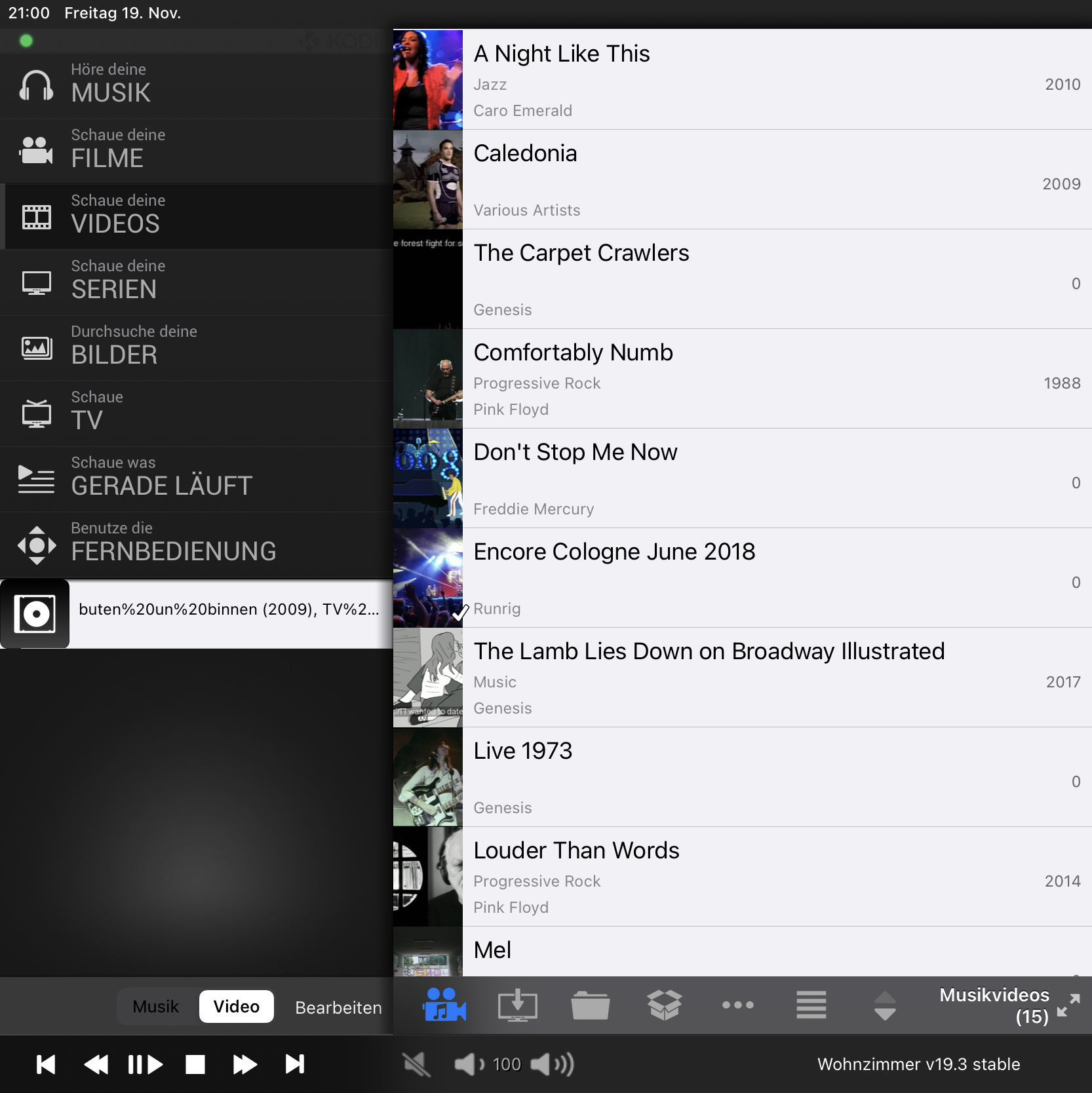
@UlfSchmidt, hopefully now the residual "0"s are not shown as year anymore

Up next: Update of German translation and features/improvements around timers (support for timer rules, different icons for scheduled recordings and reminders, ...)
Reply
Hi @Buschel,
some missing years are still shown as zeros, they are really hartnäckig Wink
For Music, everything seems to be fine now, but for Videos, they still show up in the first level list. Sad
And it seems that some information is now missing from the TV recordings list… Here, only the station and title remain listed?
Reply
Oh no, I am seeing the issues with recordings as well. I tested the screen, but I did not refresh the list. Will look into this of course.

Can you share a screenshot of the list which do still show "0"?
Reply
(2021-11-19, 21:58)Buschel Wrote: Oh no, I am seeing the issues with recordings as well. I tested the screen, but I did not refresh the list. Will look into this of course.

Can you share a screenshot of the list which do still show "0"?
Image
Reply
The "0"s persist after you pulled to refresh?
Reply
Wink 
(2021-11-19, 22:28)Buschel Wrote: The "0"s persist after you pulled to refresh?
Upps, you are right, a simple refresh did the trick.
So, I am happy to confirm that all zeros are gone. Smile
Reply
Seems we both missed a refresh when testing. Wink
In the meanwhile I found the error which caused the missing "plot" string in the recording list. That was an interesting one. For ages the wrong string was shown (the "year" string). As now the handling for "year" is stricter -- to not show "0" anymore -- the whole part was just empty. Solution is to just show the correct "plot" string.
Reply
  • 1
  • 31
  • 32
  • 33(current)
  • 34
  • 35
  • 156

Logout Mark Read Team Forum Stats Members Help
Testflight access to beta version0