Guest - Testers are needed for the reworked CDateTime core component. See... https://forum.kodi.tv/showthread.php?tid=378981 (September 29) x
  • 1
  • 40
  • 41
  • 42(current)
  • 43
  • 44
  • 156
Beta Testflight access to beta version
@UlfSchmidt, thanks for the first feedback.

The issue with the wrong display name I had overseen. I found the change which caused this, and I need to admit that the App's code is giving me a hard time here. The flag to enable sections is somehow mangled up with setting these labels. I will either find an overall better solution to properly update the labels or I will roll back the enabling of sections for some submenus.

On the Picture playlists:
  1. True. This is caused by only updating the playlist which as per API is currently playing (the one shown in NowPlaying). Maybe I can do something to solve this better. But this is only relevant for excactly this one use case (having both slide show and Music running).
  2. I do not see such flickering. My use case: Longpress a folder with pictures and select "Play" or "Queue". I only have 10 pictures in it. Maybe this happens when a huge amount of files is added?
  3. Confirmed. The API just comes back with an error, if the Picture playlist shall be edited. Deleting is possible via long pressing "Edit" (as for the other playlists). I thought of renaming the button to "Delete" only for the Picture playlist. But in fact, this issue should be fixed in Kodi. Possibly I could add a popup stating an error when pressing "Edit".
  4. For me this works (Kodi 19.3). My use case: Longpress a folder with pictures and select "Play". The play another file or select the folder for playback again. I see the playlist updating with the newly added files and the show begins. Are you having a different use case?
  5. This is difficult. I didn't change the playback control logic in the App, and I do not plan to do so. The App will always ask the API for the active player before addressing any player command. So, typically you will stop whatever is also visible on the App's NowPlaying screen. What I experience is:
    1. Picture Playlist running (also shown on NowPlaying) -> The playing Music -> Music is showing on NowPlaying -> "Stop" ends Music -> Another "Stop" ends the slide show
    2. Picture Playlist running (also shown on NowPlaying) -> The playing Video -> Video runs only until slide show moves to next picture. Then the video stops. Same is visible on the NowPlaying screen.
Reply
@Buschel

Thanks for the new beta!

With this latest beta I was finally able to reproduce an error I swear I saw a couple of months back. I now consistently reproduce.

The volume slider present at the top of the screen does not stay in sync across the remote screen and that troublesome right settings pane. The volume itself stays in sync but the mute button does not.

I’m fact you’re can get the app to be out of sync with actual Kodi. I was able to make both pane in the remote app to show as muted but Kodi itself is not muted.

As expected, if you change the settings pane mute status, go back to the remote view, then bring up the left main menu pane and tap remote menu item it reinitializes the remote pane with the last used status of mute from the settings pane.

While there is clearly an issue there, does it maybe make sense to just remove the volume slider from the settings pane? Seems overly redundant unless there’s some use case I’m completely missing?

Edit:

Another issue.

When using the rotate gesture to modify volume the volume is update instantly on Kodi but there is a delay in updating the volume slider at the top of the app.

Edit 2:

Found another strange thing. If you tap in a search box like in the movies section and then swipe back to the left pane the keyboard remains visible. This does not happen when you tap the keyboard button at the bottom of the remote. It dismisses it when going to the left pane.

Image


As an aside I would attach photos to help portray things but I don’t seem to understand how to do that here? Do I need to upload the photo somewhere and link to it?
Reply
(2022-01-08, 18:06)amasephy Wrote: As an aside I would attach photos to help portray things but I don’t seem to understand how to do that here? Do I need to upload the photo somewhere and link to it?
Yes, exactly. Best is to upload the picture and then place a link here. Just search for an image hoster. This will help me understanding the issues you are describing. Thanks for your support.
Reply
@Buschel

I updated the post with a link to the photo. For some reason it doesn’t display the picture in the post, but the link does work.
Reply
@UlfSchmidt, I think I found a good (and better) solution for the screen labels. It even allows to show more information which was formerly ignored. For submenus now the chosen filter (e.g. "Progressive Rock") and the amount of items is shown. I am not sure though if this makes sense for all submenus (e.g. for the Channel Guide or the settings menu). You can get an impression in the following screenshots.

https://abload.de/img/bildschirmfoto2022-01v8jvm.png
https://abload.de/img/bildschirmfoto2022-01jzkic.png
https://abload.de/img/bildschirmfoto2022-01xljmw.png
Reply
@amasephy
  1. I cannot reproduce this "mute-out-of-sync" issue you mention. How do you reach this situation? 
  2. Removal of the iPhone's doubled volume bar is possible of course. Let me just check, if some functionality would be missing.
  3. The volume rotation gesture for me works really smooth. The volume bar in the App moves right away. Anything special you're doing?
  4. Confirmed. This is not a regression, but the same in the official 1.9 release. I will look into this. Btw, when swiping the view to the right pane (NowPlaying) the keyboard also disappears.

Edit: 2 and 4 are implemented. See GitHub #550 and #551.
Reply
@Buschel

I’m not sure why you aren’t able to reproduce.

Rotating on gesture pad definitely results in a delay on the app updating the new volume. Kodi itself doesn’t have the delay.

As far as I can tell I’m not doing any trickery to desync mute.

I posted a video on YouTube to show what I’m doing. Unfortunately I don’t know how to get it to display tap input but basically the first thing I do is try to adjust volume by gesture. Then I adjust volume from the slider itself. Finally I desync mute.

I hope there is no issue with posting this.

https://youtube.com/shorts/qkqAPeY3a64?feature=share
Reply
@amasephy, thanks for sharing the video. I now saw the difference. You only connect to Kodi without TCP access (yellow connection status). If I connect the same way I have the same problems. You could just enable this in Kodi (Settings > Services > Control > "Allow remote control from applications on other systems"). Nevertheless I will have a look into this.

Edit: The reason is pretty simple. Without TCP connection (green lights) the App needs to poll the audio volume / mute status. This is done with a repeating timer of 1 sec. When using the rotation gesture the volume bar "follows" the Kodi volume slowly in 1 sec intervals. This is why it looks so weird. Easiest solution is to allow TCP and receive immediate notifications.
Reply
@Buschel

This makes sense. Prior to updating to Kodi 19 I had only rarely gotten the yellow status. I must have noticed the volume issue on that rare occasion.

With Kodi 19 I was always stuck with the yellow status and wasn’t sure how to resolve. I was on the verge of asking about it here but hadn’t gotten to it yet. Thanks for clarifying how to resolve!
Reply
(2022-01-08, 21:36)Buschel Wrote: @UlfSchmidt, I think I found a good (and better) solution for the screen labels. It even allows to show more information which was formerly ignored. For submenus now the chosen filter (e.g. "Progressive Rock") and the amount of items is shown. I am not sure though if this makes sense for all submenus (e.g. for the Channel Guide or the settings menu). You can get an impression in the following screenshots.

https://abload.de/img/bildschirmfoto2022-01v8jvm.png
https://abload.de/img/bildschirmfoto2022-01jzkic.png
https://abload.de/img/bildschirmfoto2022-01xljmw.png

@Buschel

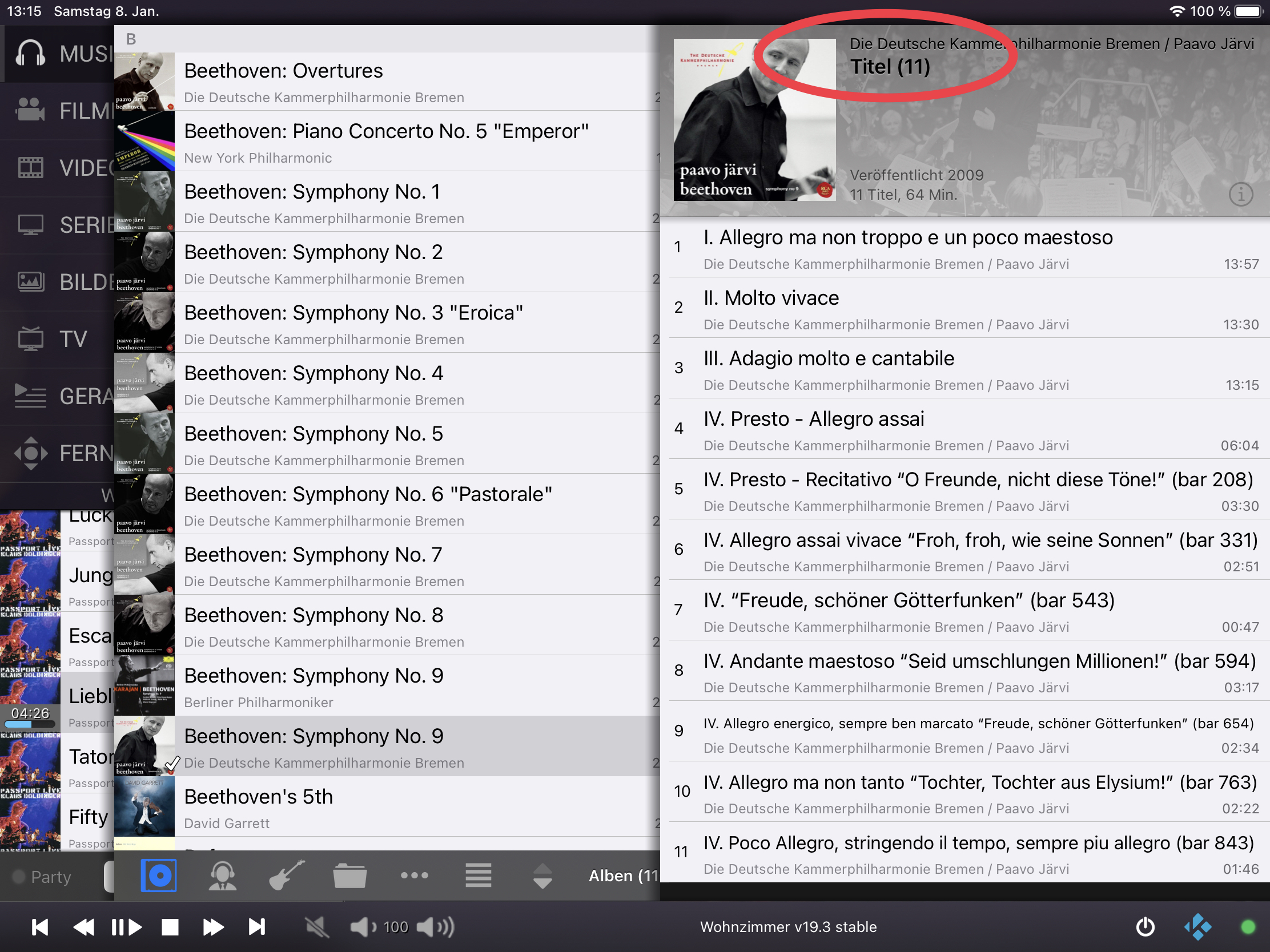
Thanks for looking into this. I’m not sure whether I get you right. With your updated implementation, you even made the screen labels more consistent, right? While I’m a big fan of consistency, this would not make sense in the context of the issue I raised, where the number of titles is already shown in the album details, but the album title is replaced by the generic screen label. Unfortunately, you don’t show how this will look in the future in your screenshots. Because at least for this view you should go back to the previous implementation, e.g. implement an exception from the general rule. Or is your new implementation always using the previous list label + the number of items, so that albums now will be titled "Beethoven: Symphony No. 9" followed by the number of tracks? Then you should consider getting rid of the additional label reading "11 Titel" at the bottom line:

Image
Reply
Oh, yes. I did not share a screenshot for the album view. This will look like it did before. In my opinion this is the only way it makes sense.

I am more concerned on the iPhone where the upper left item and the upper middle item both show the amount of items. Showing the numbers on the left side as well is using too much space und distracts the user from the middle section.

Next question is: Does it really make sense to show the number of items when entering the channel guide?

I will share some new screenshots after breakfast. Smile
Reply
Guten Appetit.
Honestly, for me showing the number of items never makes sense. Smile
Just get rid of these…
Reply
(2022-01-09, 10:46)UlfSchmidt Wrote: Honestly, for me showing the number of items never makes sense. Smile
Just get rid of these…
Not sure about this. In general I appreciate this info to be shown, even though removing this feature will reduce the code complexity. I am just not sure the App should do this in any case...

Screenshots iPad:
https://abload.de/img/bildschirmfoto2022-018hj03.png
  • The album view looks like before
  • When a filter was applied (e.g. entering the gerne "Progressive Rock") this is shown bottom right consistently, incl. the amount of results.

Screenshots iPhone:
https://abload.de/img/bildschirmfoto2022-01a3jk2.png
  • The album view looks like before
  • When a filter was applied (e.g. entering the gerne "Progressive Rock") this is shown in the middle of the navigation bar consistently, incl. the amount of results.
  • When growing through more levels in the library or the file/folders always the currently applied filter is shown in the middle (incl. amount of results), the former level is shown without amount of results.
Reply
Well done! Smile
Reply
(2022-01-01, 18:59)UlfSchmidt Wrote: I just stumbled upon a very minor glitch: Despite having selected "order by date", my movie collections are listed alphabetically:
Only if I sort them in descending order, they will be listed chronologically - but obviously with the youngest movie first…
This issue is caused by Kodi a fix is being processed(see https://forum.kodi.tv/showthread.php?tid=366329).
Reply
  • 1
  • 40
  • 41
  • 42(current)
  • 43
  • 44
  • 156

Logout Mark Read Team Forum Stats Members Help
Testflight access to beta version0