help request
I don't understand enough about coding to fix this myself, but I respect jurialmonkeys wish to focus currently on eminence as his "public work" and working on mk3 of Arctic in the back…
So I thought maybe someone sees very quickyl what needs to be done here, and can help me (it is one of the very few things that keep bothering me , otherwise I consider Arctic to be near-perfect).
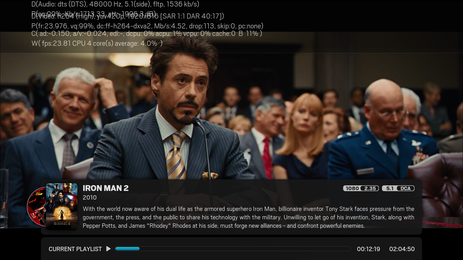
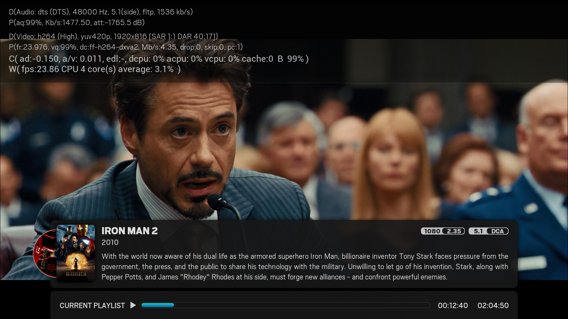
Within the codec information view, the second line always seems to be "garbled" and very hard to read (I have included a screenshot, for better understanding).
I am aware that the following code snippet is what is responsible for the codec info view on the OSD, but I do not understand what would be the value causing this overlapping …
Code:
<!-- codec info -->

        <control type="group" id="0">

            <control type="image">

                <description>media info background image</description>

                <posx>-100</posx>

                <posy>-30</posy>

                <width>2120</width>

                <height>270</height>

                <texture border="43,42,43,42">osd/fullscreen/back-codec.png</texture>

                <aspectratio>stretch</aspectratio>

            </control>

            <control type="label" id="10">

                <description>row 1 label</description>

                <posx>130</posx>

                <posy>10</posy>

                <width>1660</width>

                <height>54</height>

                <textcolor>bbwhite</textcolor>

                <font>Font-Condensed-S34</font>

                <label>-</label>

            </control>

            <control type="label" id="11">

                <description>row 2 label</description>

                <posx>130</posx>

                <posy>60</posy>

                <width>1660</width>

                <height>54</height>

                <textcolor>bbwhite</textcolor>

                <font>Font-Condensed-S34</font>

                <label>-</label>

            </control>

            <control type="label" id="12">

                <description>row 3 label</description>

                <posx>130</posx>

                <posy>110</posy>

                <width>1660</width>

                <height>98</height>

                <textcolor>bbwhite</textcolor>

                <font>Font-Condensed-S34</font>

                <label>-</label>

            </control>
If anyone could point to me which line needs to be edited, I'd be very grateful !
Screenshot for better understanding … notice how the third line overlaps the second one.


