Guest - Testers are needed for the reworked CDateTime core component. See... https://forum.kodi.tv/showthread.php?tid=378981 (September 29) x
  • 1
  • 38
  • 39
  • 40(current)
  • 41
  • 42
  • 216
Release Arctic: Zephyr
(2015-02-26, 11:46)jurialmunkey Wrote:
(2015-02-26, 08:35)morningbus Wrote: Yep, it's working now. It handles anything 16x9 (or generated from a screenscrab of the recordings) just fine, but recordings that have additional metadata (i.e. a poster instead of a screengrab) get chopped off a bit to fit:
Ah, didn't realise that it could also pull metadata with posters - thought it would only be a 16x9 thumb generated from the recording. Not quite sure what I can do about this as yet -- will have to have a think about the best approach.

Would there be a way to force a specific height, but not width? Then the posters would scale down but the 16x9 would fil out the area entirely.
Reply
(2015-02-18, 01:16)jurialmunkey Wrote:
(2015-02-17, 04:14)codenamedelta Wrote: Is there any way you can add the option to have the media info display by default on pause instead of having to hit enter on the controller and then press the up arrow?
If you have a key mapped to "info" that will also bring it up.
Theres not currently an option to auto display the full info, but I will add one as it seems many people want this and some people only have 6 button remotes (directions, ok, back) which don't have an info key.

Jurial,

Just wondering if this was still in the plans?

I know you have made quite a few changes to the OSD, but I know I would still love to see this option. Thank for all your amazing work on this skin even if you don't add the option I still love it. Tongue
Reply
(2015-02-27, 06:04)codenamedelta Wrote:
(2015-02-18, 01:16)jurialmunkey Wrote:
(2015-02-17, 04:14)codenamedelta Wrote: Is there any way you can add the option to have the media info display by default on pause instead of having to hit enter on the controller and then press the up arrow?
If you have a key mapped to "info" that will also bring it up.
Theres not currently an option to auto display the full info, but I will add one as it seems many people want this and some people only have 6 button remotes (directions, ok, back) which don't have an info key.

Jurial,

Just wondering if this was still in the plans?

I know you have made quite a few changes to the OSD, but I know I would still love to see this option. Thank for all your amazing work on this skin even if you don't add the option I still love it. Tongue

Just got a bit distracted by stuff I needed to do for repo inclusion and it slipped my mind. Added it just now, wasn't too difficult.
Arctic Fuse 2 - Alpha now available. Support me on Ko-fi.
Reply
(2015-02-27, 06:15)jurialmunkey Wrote:
(2015-02-27, 06:04)codenamedelta Wrote:
(2015-02-18, 01:16)jurialmunkey Wrote: If you have a key mapped to "info" that will also bring it up.
Theres not currently an option to auto display the full info, but I will add one as it seems many people want this and some people only have 6 button remotes (directions, ok, back) which don't have an info key.

Jurial,

Just wondering if this was still in the plans?

I know you have made quite a few changes to the OSD, but I know I would still love to see this option. Thank for all your amazing work on this skin even if you don't add the option I still love it. Tongue

Just got a bit distracted by stuff I needed to do for repo inclusion and it slipped my mind. Added it just now, wasn't too difficult.

Wow, with that, I really have no criticisms of this skin. You've outdone yourself jurial - nice work.
Reply
Perhaps the last request... Wink

Would you include the ability to check codec info ( 'o' on the keyboard )? I don't use it often, but I do like to check occasionally. It may present a problem when checking codec while playing music with the info up, as the clock is in that upper right corner.
Quick Links: debug log (wiki) | userdata (wiki) | advancedsettings (wiki) | adding videos to the library (wiki)
Reply
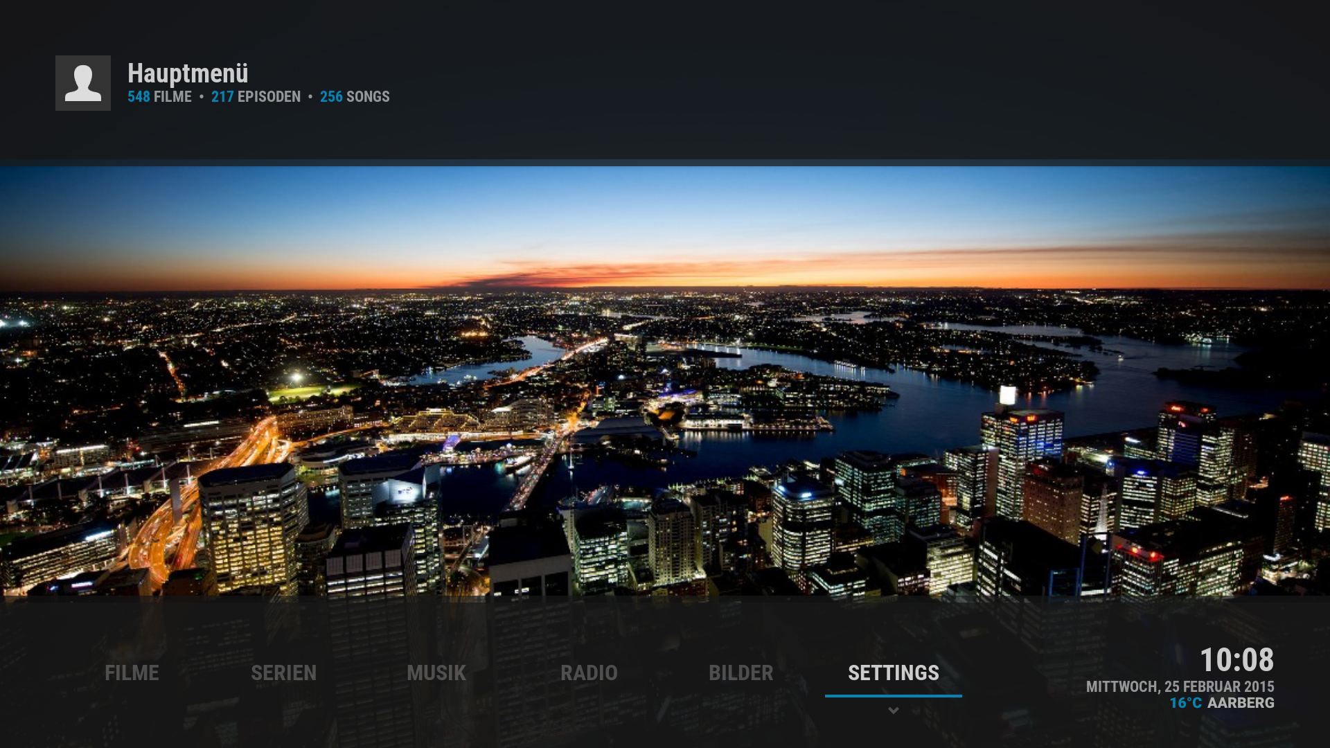
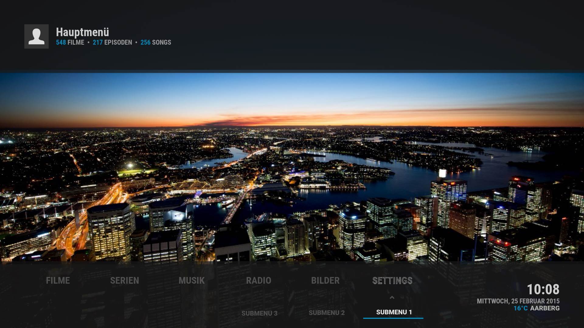
Jurialmunkey Wrote:I dont have any problems with the submenus, but I'm happy to entertain suggestions - however, I need mockups..

Just a try..

Switching from this line

Image

to this submenuline (would be tricky with icons shown)
Mockup 1

Image

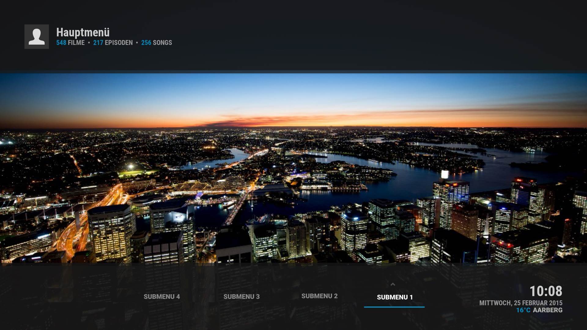
or this
Mockup 2

Image

Let me know what you think about it.

by the way i thought you want to change the text "widget loading" in a text that i less technical.

Greez

EDIT: Where can i find the logo in the left upper corner? Cant find it in media.
BTW i think this file: defaultDVDFull.png must be written big for linux
Did you something with the now playing info?
Radiochannel is no more shown there since latest git.

When playing a tv show only the name of episode is showing in the now playing layer. Name of tv shows would there also be nice, like the artist by music

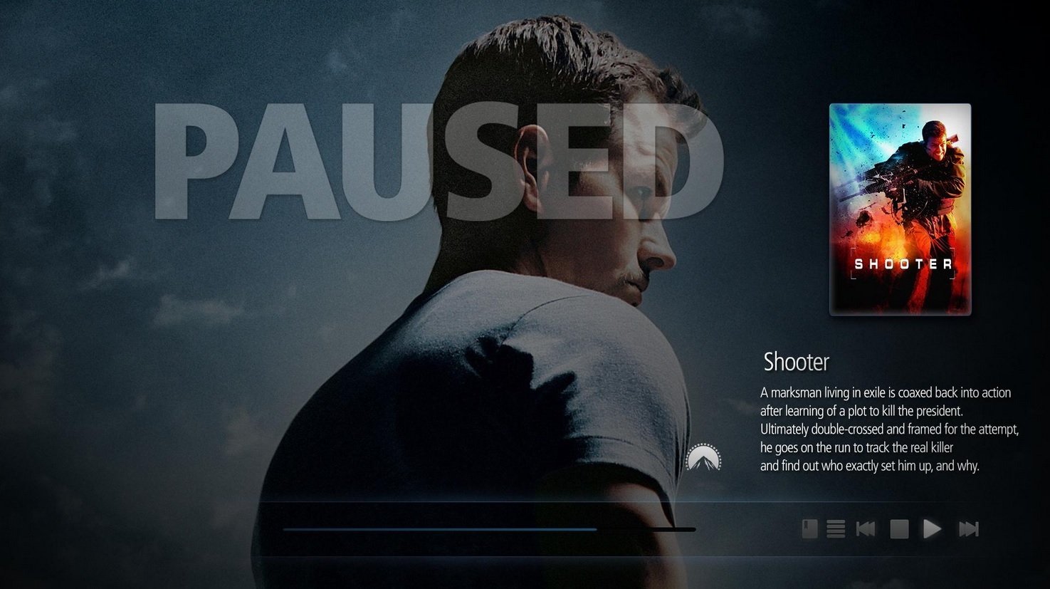
this pausescreen looks awesome:

Image
Reply
I just donated again! Your works deserve a crown.Laugh
Reply
Is it possible to maintain the white theme in the home screen and the dark theme in the other parts of the skin UI. To be honest I love the white theme in the home screen but the white in the other parts of the whole UI especially at night really affects the eyes. Just a mixture of light and dark theme but the light theme in the home screen would be great. Thanks Cool
Reply
Could we get a now playing notification option on the home screen without the whole header?

here is a crappy mockup

Image
Reply
+1
Reply
also the now playing "glow" seems to be cut off on some sides

Image
Reply
Guys we need to donate to help Jurialmunkey. He is doing a good job, lets support him. Every little helps!NodAngel
Reply
And we're on the repo.... Big Grin

(2015-02-27, 07:10)thrak76 Wrote: Would you include the ability to check codec info ( 'o' on the keyboard )? I don't use it often, but I do like to check occasionally. It may present a problem when checking codec while playing music with the info up, as the clock is in that upper right corner.
Done. Its pretty rudimentary, but I figure its just for a quick glance at it.

(2015-02-27, 09:13)magy77 Wrote: 1. (submenus) to this submenuline (would be tricky with icons shown)
2. by the way i thought you want to change the text "widget loading" in a text that i less technical.
3. Where can i find the logo in the left upper corner? Cant find it in media.
4. i think this file: defaultDVDFull.png must be written big for linux
5. Did you something with the now playing info? Radiochannel is no more shown there since latest git.
6. When playing a tv show only the name of episode is showing in the now playing layer. Name of tv shows would there also be nice, like the artist by music
7. this pausescreen looks awesome
1. I did have planned a horizontal submenu along these sort of lines, just havent got around to it yet.
2. Done. It now says "Content Loading..."
3. its at skin.arctic.zephyr/extras/icons/artist.png
4. Fixed - good catch!
5. I did do a few things, but I can't imagine why it wouldn't show. I will have to test on the loungeroom htpc as thats the only place that has radiochannels that aren't addons (addon radio channels work fine for me)
6. Good idea. done.
7. It does, but I dont think it fits the skin. Plus its a little impractical because if the video is bright it would be hard to read. Additionally not a big fan of plastering the word "PAUSED" across the screen.

(2015-02-27, 11:49)hacky4real Wrote: I just donated again! Your works deserve a crown.Laugh
Wow. Thanks so much! Very much appreciated Angel Blush

(2015-02-27, 12:16)hacky4real Wrote: Is it possible to maintain the white theme in the home screen and the dark theme in the other parts of the skin UI. To be honest I love the white theme in the home screen but the white in the other parts of the whole UI especially at night really affects the eyes. Just a mixture of light and dark theme but the light theme in the home screen would be great. Thanks Cool
I think this might add too much complexity - especially when I'm making changes, starts getting hard to keep track of all the different versions. I totally get the night thing - thats why I use the dark theme. I wish there was a way I could flip to a specific colour theme (there is a command to cycle through them, but not go to a specific one) -- if I could do that, I could have an option where it was light during the day and then at a certain time in the afternoon it changes to dark.

(2015-02-27, 13:28)kevlinmannen Wrote: Could we get a now playing notification option on the home screen without the whole header?

here is a crappy mockup
Yeah I'm working on something. The problem with just having it there with no background is that it gets really difficult to read if the fanart is light.

(2015-02-27, 13:37)kevlinmannen Wrote: also the now playing "glow" seems to be cut off on some sides
Fixed on git.
Arctic Fuse 2 - Alpha now available. Support me on Ko-fi.
Reply
Big Grin
Reply
Jurialmunkey:

One observation about extendedinfo implementation:

When you select cast, than director, you get the movies that the director has participated in as an actor. The script also pulls "crew" which would give you what movies he has directed. Not sure if you are interested in making this change.

Would you be willing to share what lines of code need to be added to views to display IMDB top250?

Thanks
Reply
  • 1
  • 38
  • 39
  • 40(current)
  • 41
  • 42
  • 216

Logout Mark Read Team Forum Stats Members Help
Arctic: Zephyr37