Posts: 6,684
Joined: Mar 2009
Reputation:
147
phil65
Retired Team-Kodi Member
Posts: 6,684
Moved thread to correct subforum.
Posts: 3,649
Joined: Sep 2009
Reputation:
121
I for one like it and think it fills a gap. Is your plan to submit it upstream?
Addons I wrote &/or maintain:
OzWeather (Australian BOM weather) | Check Previous Episode | Playback Resumer | Unpause Jumpback | Caber Toss | Switchback | XSqueezeDisplay | Kodi 2nd Display
Sorry, no help w/out a
*full debug log*.
Posts: 7
Joined: Dec 2015
Reputation:
1
2015-12-04, 13:42
(This post was last modified: 2015-12-04, 13:43 by Stefan-Code.)
Glad you like it. Yeah, I asked in #kodi-dev if it's ok to submit a Pull request for it.
Posts: 1,483
Joined: Aug 2010
2015-12-04, 17:48
(This post was last modified: 2015-12-04, 18:08 by Robotica.)
Nice, reducing redunancy is great for UX. If accepted, similar can be done to:
1> "Big list"-view has no extra value above "List". Integrating into 1 view and conditionally replace "filesize" with "Date taken" in the picture section.
2> "Thumb" and "Pic thumb"-views can be integrated to one and remove the Thumb view from the picture section.
Posts: 7,135
Joined: Oct 2012
un1versal
Out of Memory (1939–2016)
Posts: 7,135
This is only done with Movies in mind, removing media info 2/3 is bad for TV shows imo.
Posts: 421
Joined: Dec 2008
Reputation:
5
2015-12-06, 22:14
(This post was last modified: 2015-12-06, 22:24 by jpf55.)
I love it
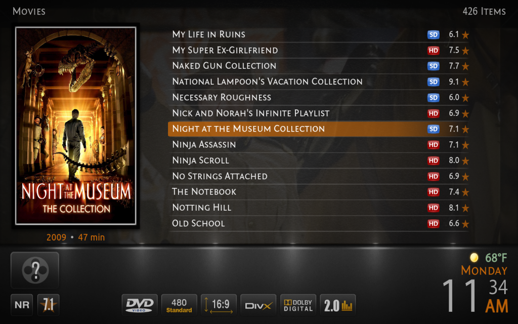
For my taste, the only thing missing is the MovieDuration, to the right of the ProductionYear
I have tried to modify MediaInfo3 but I'm not having any success.
Edit:
I was hoping all I had to do was to change:
IncludesBackgroundBuilding.xml
ViewsVideoLibrary.xml
MyVideoNav.xml
but did not work... oh well
MacMini 2.3gHz i7, OS X 10.13.6
Running Kodi 18.9
Posts: 7,135
Joined: Oct 2012
un1versal
Out of Memory (1939–2016)
Posts: 7,135
2015-12-07, 14:17
(This post was last modified: 2015-12-07, 14:27 by un1versal.)
@
Stefan-Code re
your reply in Github PR
Just regarding removal of Media info 2 and Media info 3 views, I dont thik this is a suitable replacement for TV shows as I prefer the lower window to show more of the background, in specific areas I prefer both tall or both lower, mixing them up is not for me personally as the symmetry is lost (what makes it bearable to me is that symmetry), but if your idea is added and none removed it be OK, but if media info 2/3 are removed as a result I consider this a great loss.
What would be nice to see is a removal of these windows low/tall completely and making it all full screen while keeping same style, with space to spare to show all nice info/streamdetails/flags, that is something Ide personally get behind fully, these half windows have always neither provided full view of background nor allow viewing of all streamdetails properly but if youre tuck with Confluence the experience has to be as good as it gets, something this addition just reminds me more of whats wrong with the skin design.
Devs like to keep the skin simple but this two pane view is far from that imo.
Posts: 7,135
Joined: Oct 2012
un1versal
Out of Memory (1939–2016)
Posts: 7,135
By full screen I mean only one big window with the information from the two windows.
Im not suggesting what metropolis does exactly but you maybe get the idea

Posts: 7,135
Joined: Oct 2012
un1versal
Out of Memory (1939–2016)
Posts: 7,135
2015-12-07, 16:37
(This post was last modified: 2015-12-07, 16:38 by un1versal.)
By full screen I mean only one big window with the information from the two windows.
Im not suggesting what metropolis does exactly but you maybe get the idea

That sort of thing is also what confluence spirit of its conception means, taking the best ideas of others skins and implementing it into one.
Posts: 7
Joined: Dec 2015
Reputation:
1
2015-12-07, 16:39
(This post was last modified: 2015-12-07, 16:47 by Stefan-Code.)
I see what you mean, however using that approach hides the background fanart even further.
I could try how it looks like when the right column is full height too and the poster thumb is centered in the middle with the description below it instead of next to it, however I have the feeling it won't turn out very well.


