Guest - Testers are needed for the reworked CDateTime core component. See... https://forum.kodi.tv/showthread.php?tid=378981 (September 29) x
  • 1
  • 7
  • 8
  • 9(current)
  • 10
  • 11
  • 155
Beta Testflight access to beta version
1.6.2 Build 2109:
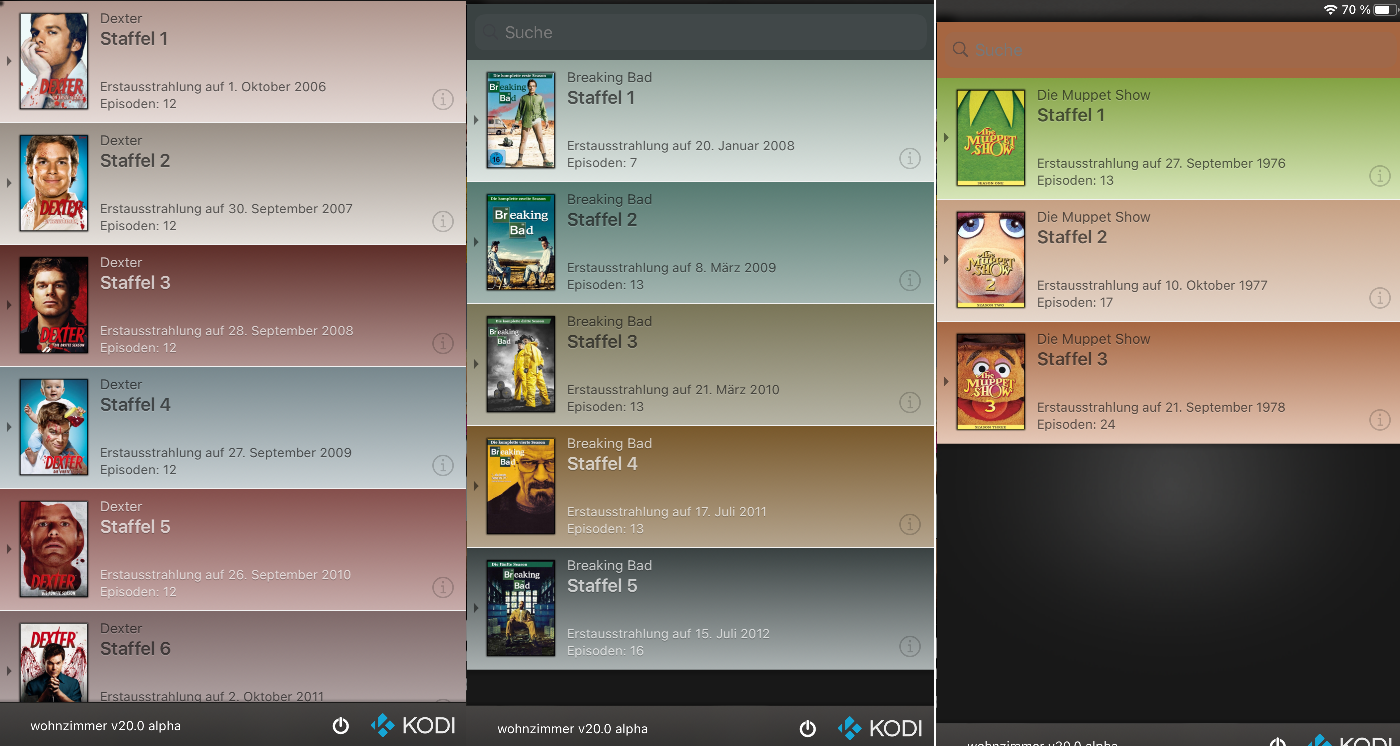
- Feature: Derive color from seasons cover (closes #153)
- Feature: Better readability for TV station logos (closes #153)
- Feature: Show TV station logos for recording (closes #176)
- Feature: Enable Video Playlists support (reported in forum post)
- Stability: Avoid possible crash when updating channel list (most reported crash for 1.6 and 1.6.1)
- Bugfix: Fix shuffle/repeat in overlays not working for iPads (reported in forum post)
- Bugfix: Fix wrong index sorting for playcount (closes #184)
Reply
Thanks for this update @Buschel!

- Feature: Derive color from seasons cover - this looks fantastic
- Feature: Better readability for TV station logos - not working for me (using tvheadend and Kodi Matrix), no logos shown, except for recordings
- Feature: Show TV station logos for recording - yes, but black logo on black canvas
- Feature: Enable Video Playlists support - not (yet) tested
- Stability: Avoid possible crash when updating channel list (most reported crash for 1.6 and 1.6.1) - no further crashes so far
- Bugfix: Fix shuffle/repeat in overlays not working for iPads - yes!!
- Bugfix: Fix wrong index sorting for playcount - not (yet) tested
Reply
Thanks for the feedback, Ulf!

Did you see TV station logos before this build? Or is just a wrong background color chosen (e.g. black logos on dark gray background) as you report for recordings?
Reply
(2021-03-14, 19:26)Buschel Wrote: Did you see TV station logos before this build? Or is just a wrong background color chosen (e.g. black logos on dark gray background) as you report for recordings?
In a very much older build, station logos where shown somehow (see my post from 2021-01-31, 12:37), but since then I only get a generic TV set presented instead of a station logo (in list views and in detail views). In grid view, just black squares are shown with a station label underneath. Hope this helps, otherwise I have to find out what’s the best practice here to post screenshots, too...
Reply
(2021-03-14, 19:35)UlfSchmidt Wrote: In a very much older build, station logos where shown somehow (see my post from 2021-01-31, 12:37), but since then I only get a generic TV set presented instead of a station logo (in list views and in detail views). In grid view, just black squares are shown with a station label underneath. Hope this helps, otherwise I have to find out what’s the best practice here to post screenshots, too...
Thanks for sharing your TV station logos. I reworked the calculation for the background color choice -- which definitely was wrong before -- and now it works much better, also for your logos (screenshots can be found here: #197). I do not know why logos are not loaded at all for your setup. At least I am not aware of any changes related to loading the logos since 1.6.1.
Reply
1.6.2 Build 2124:
- Feature: Resize stackview for iPad (closes #154)
- Feature: Enable fullscreen for music albums and artists (closes #196)
- Bugfix: Fix sort-by-playcount for few music album cases (closes #192)
- Bugfix: Optimize background color for TV station logos (reported issue for last build, screenshots in #197)

@UlfSchmidt, would be great if you could verify the TV station logo fix on your side.
Reply
Thumbs Up 
Fantastisch!
Everything looks soooo good now!
I like the new music browsing capabilities, the TV station logos which are visible for me for the very first time, everything.
Thank you so much for continuous support.

One minor issue I recently stumbled upon:
If one switched to grid view in music, when it comes to searching, there is the friendly reminder to use list view for searching.
But when I am in grid view for my albums or so and then switch e.g. to “All songs”, which does not have any grid view, I have nevertheless no search field.
I have to manually revert to list view for albums and then go back to my previous “All songs” view in order to have the search field available.
Maybe this could be easily tackled in some future update?
Reply
(2021-03-19, 22:47)UlfSchmidt Wrote: Fantastisch!
Everything looks soooo good now!
I like the new music browsing capabilities, the TV station logos which are visible for me for the very first time, everything.
Thank you so much for continuous support.
Thanks for quick (!) confirmation the fixes work. Smile
 
(2021-03-19, 22:47)UlfSchmidt Wrote: One minor issue I recently stumbled upon:
If one switched to grid view in music, when it comes to searching, there is the friendly reminder to use list view for searching.
But when I am in grid view for my albums or so and then switch e.g. to “All songs”, which does not have any grid view, I have nevertheless no search field.
I have to manually revert to list view for albums and then go back to my previous “All songs” view in order to have the search field available.
Maybe this could be easily tackled in some future update?
I can confirm the issue you describe. This is also happening for other "more" views like "Top 100 Albums" when entering them from an album or artist grid view. I will take a look at this.

Next changes in the pipeline are related to maintenance (removing deprecated functions), adding sort token support and some stability fixes.
Reply
Just found a regression. When entering the album details view the titles are sorted by label/name and not by track id. I found the root cause and get this fixed. Sorry for any inconvenience.
Reply
1.6.2 Build 2142:
- Bugfix: Fixes regression of last build using wrong sort order (e.g. album details, playlists PVR channel lists). Sort order was always "by label".
- Bugfix: Longpress on iPad shows from wrong origins for lists and fullscreen items (closes #198)
- Maintenance: Replaced deprecated functions (UIAlertView, UIActionSheet, UIPopoverController, NSURLConnection:connectionWithRequest:delegate)

What needs testing?
- With the maintenance changes all action menus and alert/info popups were changed. Even though every single one of them was tested at the time of implementing the changes it will be good to have an eye on them. The menus/popups typically appear when long-pressing items, performing an action (e.g. adding or pressing action buttons) or when errors occurs (e.g. JSON error).
- All types of long-press actions on iPad. Are they working, is the origin shown correctly?

What´s next?
- Further maintenance changes to remove deprecated functions related to rotation and webview
- Stability fixes based on crash report from 1.6.1
- Some feature polishing around TV station icons
- Possibly support for sort tokens
Reply
Hey guys, i didn't notice this earlier and possibly @UlfSchmidt will hate me for this one Tongue

don't you think this here is a bit toooo colorful?... i know it is intended tho, but i needed to share this shot

Image
Reply
Depends obviously on the type of DVD cover, I get mostly muted colors, looking good in my opinion - Your Muppet Show Series 1 really looks ugly, I agree ...

Image

PS: Schön zu sehen, dass auch andere ihre Kodis „Wohnzimmer“ usw. nennen Smile
Reply
@Buschel
Small bug: Each rotation of the iPad causes now the selector of the Kodi instance to appear...
Reply
(2021-03-30, 07:31)UlfSchmidt Wrote: @Buschel
Small bug: Each rotation of the iPad causes now the selector of the Kodi instance to appear...
Thanks and confirmed, this will be fixed as part of the PR which removes the deprecated rotation functions.
Reply
(2021-03-29, 23:48)howie-f Wrote: don't you think this here is a bit toooo colorful?... i know it is intended tho, but i needed to share this shot
The Muppet Show colors are really a bit off. I can reduce or limit the saturation for sure. Let me see what I can do. Smile
Reply
  • 1
  • 7
  • 8
  • 9(current)
  • 10
  • 11
  • 155

Logout Mark Read Team Forum Stats Members Help
Testflight access to beta version0