Guest - Testers are needed for the reworked CDateTime core component. See... https://forum.kodi.tv/showthread.php?tid=378981 (September 29) x
  • 1
  • 19
  • 20
  • 21(current)
  • 22
  • 23
  • 156
Beta Testflight access to beta version
Additional observation - although I think I mentioned this already earlier (read: a long time ago):
The Web interface of Kodi (Chorus) also only shows the status logos of some channels (in fact the same channels are missing Wink ), and ARD + ZDF are now also present in Chorus. So it is NOT a bug in the App, but within Kodi 17.
I think you can close this issue, it’s working with Kodi 19, it is not working with Kodi 17, but there’s also most likely nothing you can do about it?!
And it is definitely not a regression Smile
Reply
(2021-07-15, 13:21)UlfSchmidt Wrote: The Web interface of Kodi (Chorus) also only shows the status logos of some channels (in fact the same channels are missing), and ARD + ZDF are now also present in Chorus. So it is NOT a bug in the App, but within Kodi 17.
Thanks for looking into the issue again. I was not remembering that the Chorus UI also does not show the icon. This really sounds a problem of Kodi 17, and I am not sure I will further investigate. There´s more interesting stuff to work on.
Reply
(2021-07-15, 18:53)Buschel Wrote:
(2021-07-15, 13:21)UlfSchmidt Wrote: The Web interface of Kodi (Chorus) also only shows the status logos of some channels (in fact the same channels are missing), and ARD + ZDF are now also present in Chorus. So it is NOT a bug in the App, but within Kodi 17.
Thanks for looking into the issue again. I was not remembering that the Chorus UI also does not show the icon. This really sounds a problem of Kodi 17, and I am not sure I will further investigate. There´s more interesting stuff to work on.
Exactly! Stop worrying about my very local icon issues on a single old and outdated setup and move forward.
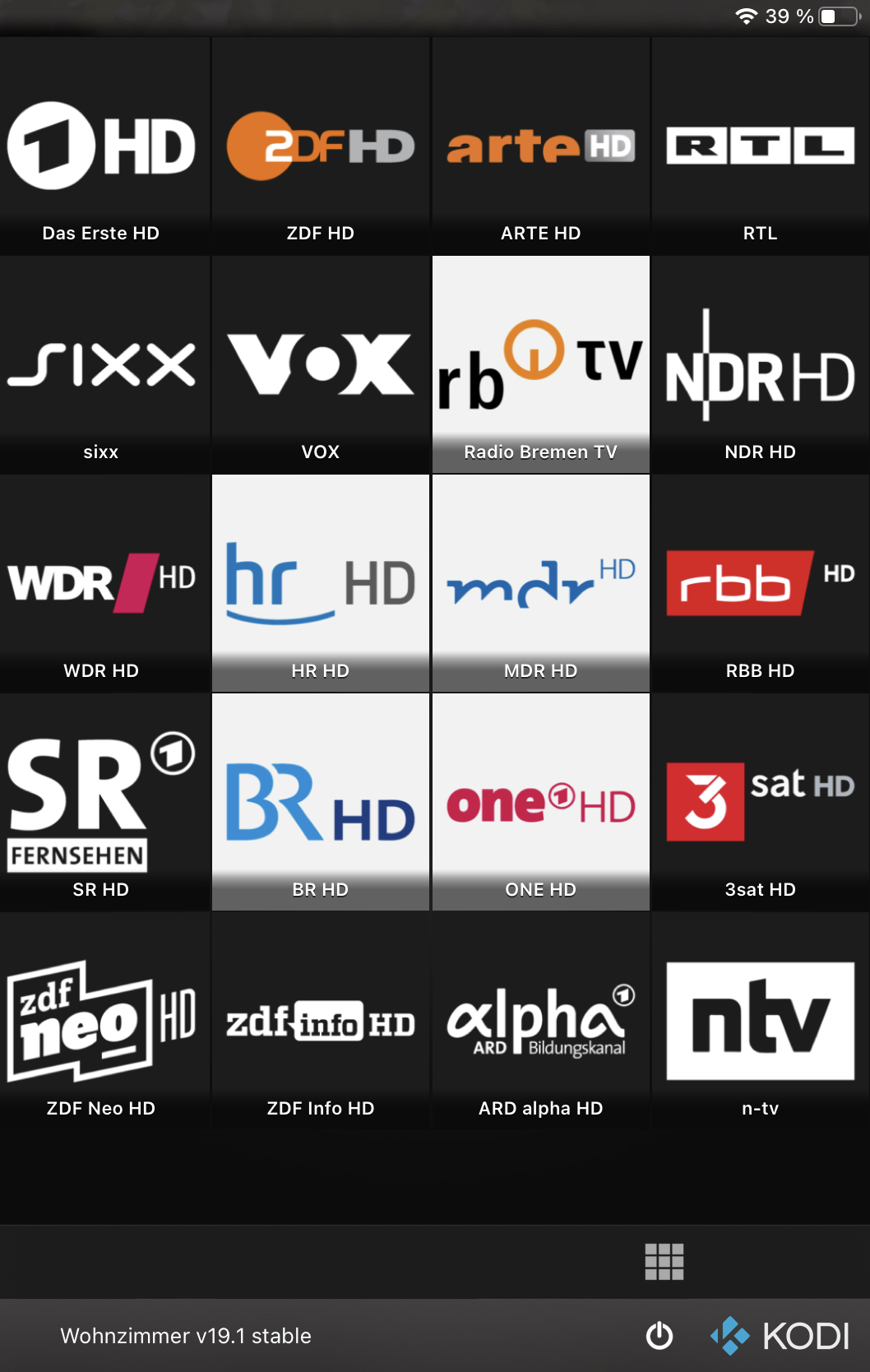
To cheer you up, a last look (Kodi 19): Smile
Image
Reply
(2021-07-15, 19:15)UlfSchmidt Wrote: To cheer you up, a last look (Kodi 19):
Nice, even the automatic background color selection seems to make a good choice. Smile
Reply
Yes! Smile
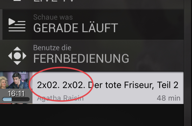
But can you explain this?
Image
This minor issue is related to Kodi 19 - this works well with Kodi 17.
So I have no idea whether you can do anything about it?
Reply
(2021-07-15, 20:34)UlfSchmidt Wrote: This minor issue is related to Kodi 19 - this works well with Kodi 17.
So I have no idea whether you can do anything about it?
I quickly tested with my LiveTV and some TVShows with Kodi 19.1. I do not see this kind of double numbering. What is your exact use case?
Reply
(2021-07-15, 20:59)Buschel Wrote:
(2021-07-15, 20:34)UlfSchmidt Wrote: This minor issue is related to Kodi 19 - this works well with Kodi 17.
So I have no idea whether you can do anything about it?
I quickly tested with my LiveTV and some TVShows with Kodi 19.1. I do not see this kind of double numbering. What is your exact use case?
This happens when I play any episode of any of my archived TV series (sorry that I was not clear enough, this is not related to Live TV), and it is only shown in the video playlist not correctly. It is displayed correctly anywhere else.
Reply
(2021-07-15, 21:16)UlfSchmidt Wrote: This happens when I play any episode of any of my archived TV series (sorry that I was not clear enough, this is not related to Live TV), and it is only shown in the video playlist not correctly. It is displayed correctly anywhere else.
Weird, I never see this with any of my episodes. Looking at the code this can only happen if the episode label contains the "1x01"-part as well (this is the case for the episode view -- the one where all seasons and episodes are listed). How exactly are you starting to play the episodes? And how do the episodes show up in Chorus?
Reply
(2021-07-16, 07:50)Buschel Wrote:
(2021-07-15, 21:16)UlfSchmidt Wrote: This happens when I play any episode of any of my archived TV series (sorry that I was not clear enough, this is not related to Live TV), and it is only shown in the video playlist not correctly. It is displayed correctly anywhere else.
Weird, I never see this with any of my episodes. Looking at the code this can only happen if the episode label contains the "1x01"-part as well (this is the case for the episode view -- the one where all seasons and episodes are listed). How exactly are you starting to play the episodes? And how do the episodes show up in Chorus?
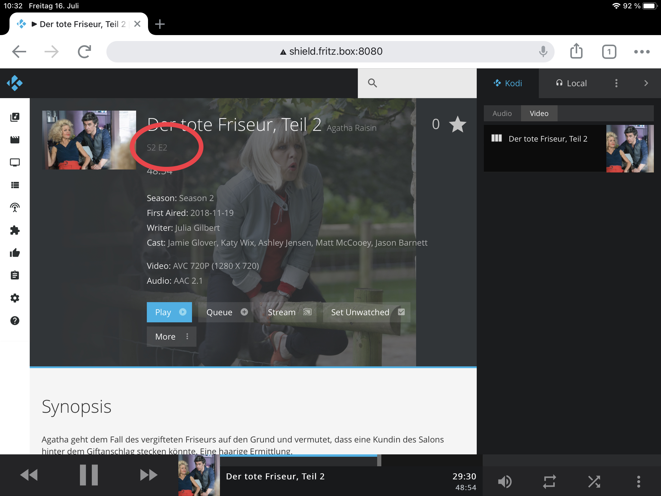
Good hint: it behaves differently. When I start an episode directly from the Kodi Remote App, everything’s fine. But when I start the same episode from within Kodi itself, the episode number is doubled in the playlist. In Chorus, there is also no such label shown at all, see below:
Image
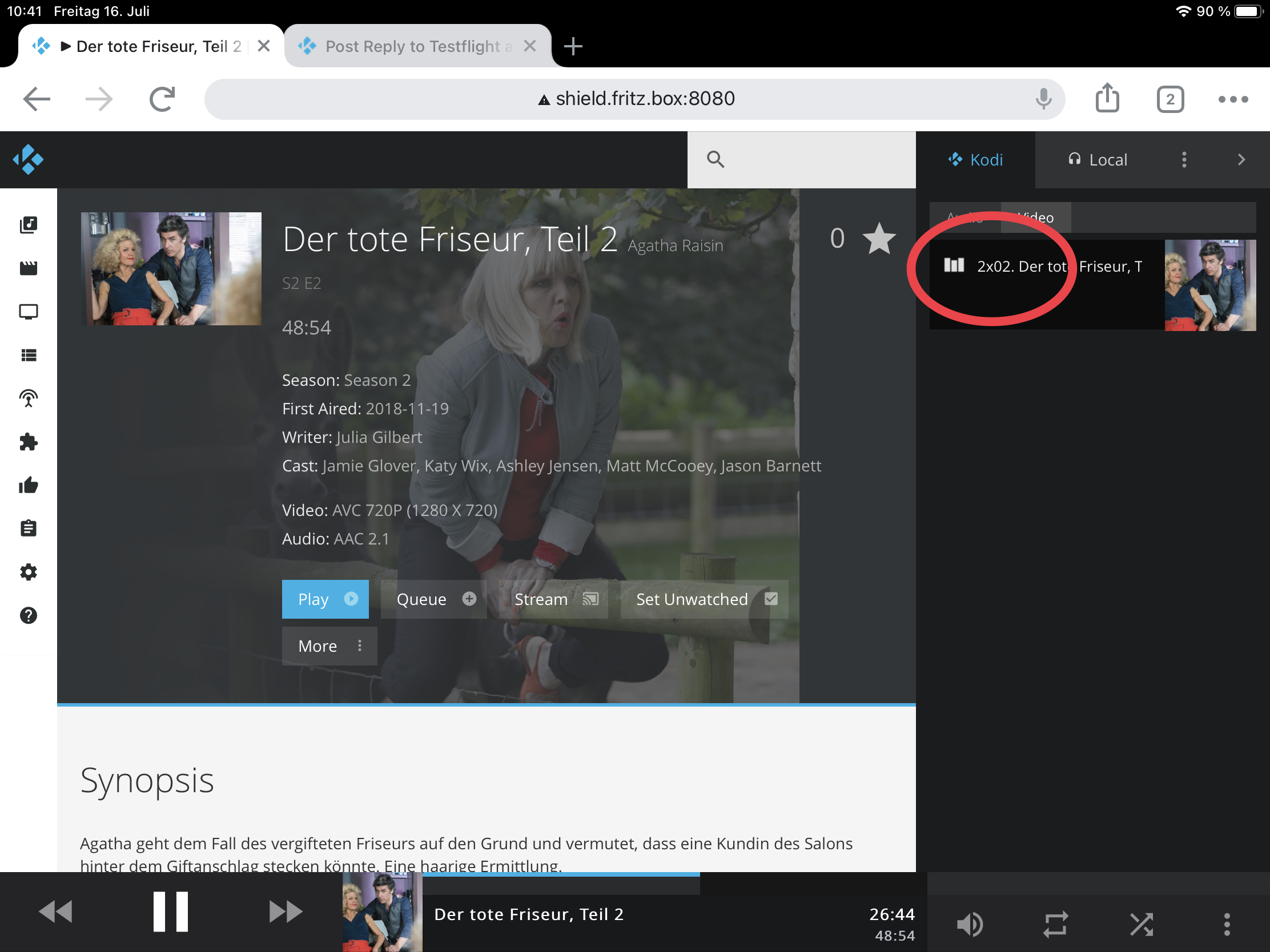
But, when started directly from Kodi using the Kodi Remote of the App and not the archive browser, one label is also there in Chorus:
Image
So, once again it looks like that the root cause of the issue is not to be found in the App, but in Kodi itself. Maybe you may want to implement a small workaround by simply not adding another episode label when one is already present?
Reply
(2021-07-16, 10:49)UlfSchmidt Wrote: So, once again it looks like that the root cause of the issue is not to be found in the App, but in Kodi itself. Maybe you may want to implement a small workaround by simply not adding another episode label when one is already present?
Thanks for digging into it. I found another (easier) way to not show the intial "1x01" (or whatever season/episode): Instead of using API's "label" I now use "title". This results in intended behaviour. But I am not sure, if there might regressions show up when using older Kodi versions. This needs to be tested when the fix got merged and a test build is provided.
Reply
It would be great if the users which do not follow the changes in GitHub (should be most), could take a look at the screenshots in following changes in GitHub and share your feedback. These are related to new features which could be added to the Remote App.

1. Moveable Remote Screen: PR#344
2. Bits per sample & HiRes logo: PR#349
3. Rounded corners for thumbnails: PR#351
Reply
Thumbs Up 
Hi @Buschel,
Great work as always! Really would like to see the additional HiRes Audio indicator and the information about the bits/sample in the final version of the next update.
But honestly, regarding the two other changes I feel indifferent. Never had any problems with the remote panel (I’m used to use both hands - on both iPhone and iPad) and while I like the look of the rounded corners I was also always fine with the previous look. But rounded corners obviously better fit within Apple’s standard look and feel, so why not do the same?
Best regards,
Ulf
Reply
(2021-07-25, 17:25)UlfSchmidt Wrote: Hi @Buschel,
Great work as always! Really would like to see the additional HiRes Audio indicator and the information about the bits/sample in the final version of the next update.
But honestly, regarding the two other changes I feel indifferent. Never had any problems with the remote panel (I’m used to use both hands - on both iPhone and iPad) and while I like the look of the rounded corners I was also always fine with the previous look. But rounded corners obviously better fit within Apple’s standard look and feel, so why not do the same?
Best regards,
Ulf
Thanks, @UlfSchmidt. I was expecting you, as an Audio focused user, to give +1 for the HiRes feature. Smile

The remote changes were asked by some users, and I can understand the remote is difficult to use one-handed on the newer devices with bigger screens. The implementation also opened up the App for few more options to re-design the remote screens for such devices -- e.g. always having the volume control on the remote screen.

The "rounded corners" feature I personally like a lot. This really gives a modern look & feel. The implementation adds on option to enable/disable it. So, it should allow to configure this as per own taste.
Reply
1.7.2 Build 2515
Release Notes

Summary:
Two features (audio stream information and new 4K/8K UHD logos), few bugfixes and some maintenance. Details can be seen via the Release Notes link.

What´s next:
- Feature: Rework of remote screen (top or bottom position selectable, unified toolbar for iPhone/iPad)
- Feature: Thumbnails with rounded corners (configurable in settings menu)
- Maintenance: Further coding styles changes
Reply
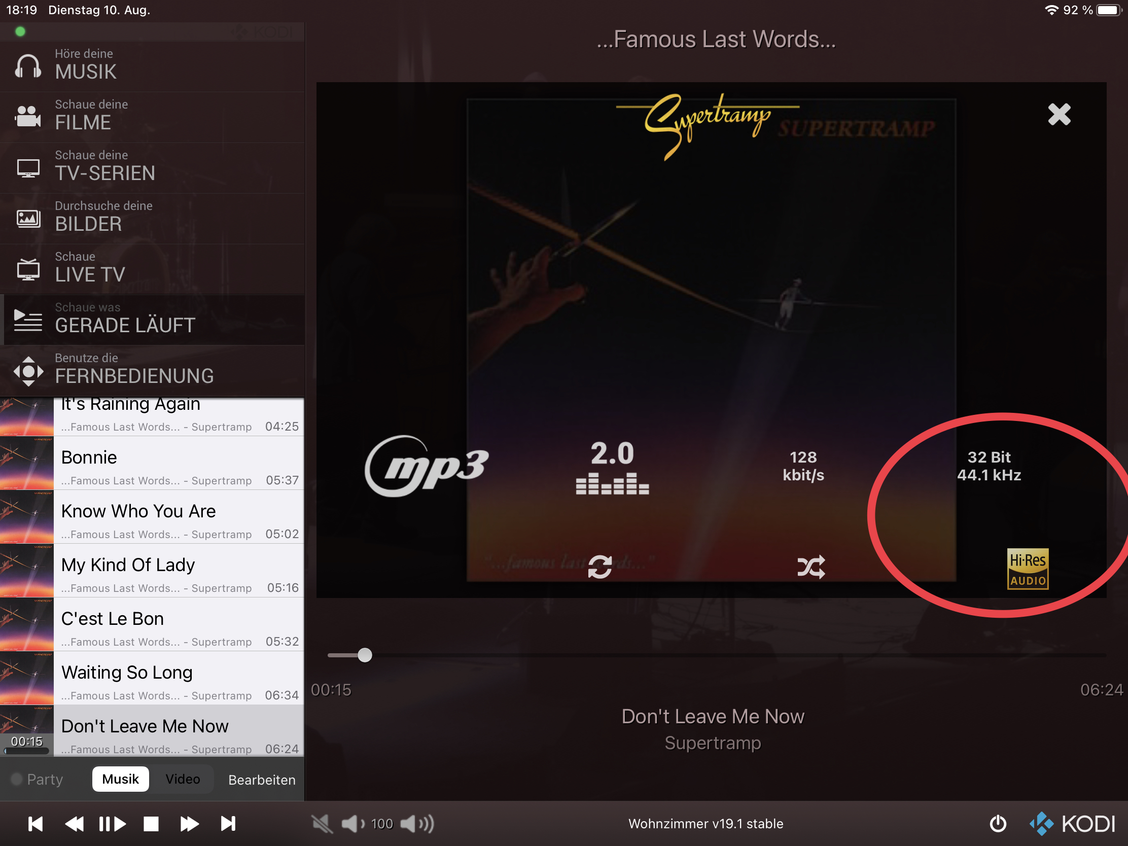
Sorry @Buschel, but the High Res indicator is not working well, at least in my setup (in which all mp3 files are treated by Kodi as 32 bit/sample):

Image

But true high res flac files sampled at 88.2 kHz are not rendered as High Res. Maybe you can refine your conditions?
On my Kodi skin, I use the following condition to show the indicator:
(Filetype = flac | Filetype = wav) and (Samplerate > 48 kHz | Samplewidth > 16 bit)

The good news is that everything else you put so much effort in is working very well Smile
So thanks for your continuous contribution!
Reply
  • 1
  • 19
  • 20
  • 21(current)
  • 22
  • 23
  • 156

Logout Mark Read Team Forum Stats Members Help
Testflight access to beta version0