Guest - Testers are needed for the reworked CDateTime core component. See... https://forum.kodi.tv/showthread.php?tid=378981 (September 29) x
  • 1
  • 20
  • 21
  • 22(current)
  • 23
  • 24
  • 156
Beta Testflight access to beta version
(2021-08-10, 18:39)UlfSchmidt Wrote: Maybe you can refine your conditions?
On my Kodi skin, I use the following condition to show the indicator:
(Filetype = flac | Filetype = wav) and (Samplerate > 48 kHz | Samplewidth > 16 bit)
Sure, this can be changed if needed. The current condition in the App is:
([bps integerValue] >= 24 || [kHz integerValue] >= 96)

I took this from Wikipedia (HiRes), but I admit that 88.2 kHz is the 44.1-based equivalent to 96 kHz. This can be changed quickly.

What I did not expect is that mp3 shows 32 bit stream resolution. I tested with musepack which shows 16 bit stream resolution. And, in fact, both formats in general use floating point and can reach a dynamic range comparable to 24-32 bit resolution. Kind of inconsistent, but I need to deal with it. Smile

If I change the condition to something like "(lossless && (bps >= 24 || kHz >= 88))", I need to find a good solution to identify lossless formats. From the Kodi page (Audio_Player) I would select the following: AIFF, WAV/WAVE, ALAC, FLAC, Monkey's Audio (APE), SHN, (WavPack). WavPack is already debatable as this also supports lossy compression.
Reply
(2021-08-10, 19:51)Buschel Wrote: If I change the condition to something like "(lossless && (bps >= 24 || kHz >= 88))", I need to find a good solution to identify lossless formats. From the Kodi page (Audio_Player) I would select the following: AIFF, WAV/WAVE, ALAC, FLAC, Monkey's Audio (APE), SHN, (WavPack). WavPack is already debatable as this also supports lossy compression.
Oh, I am using only mainstream filetypes, I guess, like mp3 (from the early beginning of my music archive digitalization), flac (nowadays) and some aac (aka as m4a) from Apple’s iTunes Store. Don’t know if the others have some more widespread use or not. At least, I can only test these…
Maybe the bitrate could be another dirty option to select between lossy and lossless? Something like bitrate > 320? Or are there any lossy formats using, despite of being lossy, more than 320 kbit/s? Highres files almost always have bitrates > 1000…
Just another stupid idea of mine Wink
Reply
(2021-08-10, 20:09)UlfSchmidt Wrote:
(2021-08-10, 19:51)Buschel Wrote:  
Maybe the bitrate could be another dirty option to select between lossy and lossless? Something like bitrate > 320? Or are there any lossy formats using, despite of being lossy, more than 320 kbit/s? Highres files almost always have bitrates > 1000…
This is imho not a good option. The bitrates depend on the amount of channels and also the compression ratio which can differ a lot for different material. I think it is really best to check if a lossless codec is meeting the HiRes requirements. And even this can of course be faked, e.g. upsampled material or decoded lossy material. But same problems exist with streaming/download services offering "HiRes" material -- so nothing I should worry about.

I will search for a few sample files to check which codec names are provided by the (current) Kodi API.
Reply
I now prepared a change which applies following logic: if (isLossless && (bps >= 24 || kHz >= 88) && !(bps < 16 || kHz < 44)). This way files with high bits-per-sample, but samplerate < 44.1 kHz and files with high samplerate but bits-per-sample < 16 are not by fault assumed as HiRes. The following codecs are purely lossless and will be interpreted as lossless:
  1. WMA lossless
  2. True Audio (TTA)
  3. Shorten (SHN)
  4. Real Audio Lossless Format (RALF)
  5. MPEG4 Audio Lossless Coding (MPEG-ALS)
  6. Meridian Lossless Packaging (MLP)
  7. Free Lossless Audio Codec (FLAC)
  8. Monkey's Audio (APE)
  9. Apple Lossless Audio Codec (ALAC) 
To my knowledge the other potentially lossless" codecs are hybrid codecs which are not always lossless.

In addition, I added several audio codec logos the the app. For details look at https://github.com/xbmc/Official-Kodi-Re...S/pull/354. I might add more logos at a later point in time (e.g. ATRAC).
Reply
(2021-08-13, 12:33)Buschel Wrote: I now prepared a change which applies following logic: if (isLossless && (bps >= 24 || kHz >= 88) && !(bps < 16 || kHz < 44)). This way files with high bits-per-sample, but samplerate < 44.1 kHz and files with high samplerate but bits-per-sample < 16 are not by fault assumed as HiRes. The following codecs are purely lossless and will be interpreted as lossless:
  1. WMA lossless
  2. True Audio (TTA)
  3. Shorten (SHN)
  4. Real Audio Lossless Format (RALF)
  5. MPEG4 Audio Lossless Coding (MPEG-ALS)
  6. Meridian Lossless Packaging (MLP)
  7. Free Lossless Audio Codec (FLAC)
  8. Monkey's Audio (APE)
  9. Apple Lossless Audio Codec (ALAC) 
To my knowledge the other potentially lossless" codecs are hybrid codecs which are not always lossless.

In addition, I added several audio codec logos the the app. For details look at https://github.com/xbmc/Official-Kodi-Re...S/pull/354. I might add more logos at a later point in time (e.g. ATRAC).
Great work, as always.
What do you think about making the Hi Res Audio logo also monochrome (for consistency) and maybe squeeze it into the same row as the remaining information?
Reply
(2021-08-13, 12:42)UlfSchmidt Wrote:
(2021-08-13, 12:33)Buschel Wrote:  
Great work, as always.
What do you think about making the Hi Res Audio logo also monochrome (for consistency) and maybe squeeze it into the same row as the remaining information?
Making the HiRes icon grayscale looks a bit boring. There are even quite some icons which have color, e.g. musepack, flac and DTS codecs. I admit, the position of the logo is not optimal. I could only move this into the same row for iPads. Otherwise there is not enough space for the other icons -- the become really hard to read. In this case I would -- for consistency -- not have a different layout for iPad and iPhone.

On ATRAC logos: Except for Atrac3plus they look pretty decent from the start. For ATRAC3plus I needed to rescale to a reduced width to get it readable. It should be ok now.
Reply
(2021-08-13, 18:28)Buschel Wrote:
(2021-08-13, 12:42)UlfSchmidt Wrote:
(2021-08-13, 12:33)Buschel Wrote:  
Great work, as always.
What do you think about making the Hi Res Audio logo also monochrome (for consistency) and maybe squeeze it into the same row as the remaining information?
Making the HiRes icon grayscale looks a bit boring. There are even quite some icons which have color, e.g. musepack, flac and DTS codecs. I admit, the position of the logo is not optimal. I could only move this into the same row for iPads. Otherwise there is not enough space for the other icons -- the become really hard to read. In this case I would -- for consistency -- not have a different layout for iPad and iPhone.

On ATRAC logos: Except for Atrac3plus they look pretty decent from the start. For ATRAC3plus I needed to rescale to a reduced width to get it readable. It should be ok now.
Do you really think there are any Atrac or even Atrac3 or even Atrac3plus files somewhere in use, as this was the compression format used by minidisc until 2004! Wink
Reply
(2021-08-13, 18:58)UlfSchmidt Wrote:
(2021-08-13, 18:28)Buschel Wrote:
(2021-08-13, 12:42)UlfSchmidt Wrote:  
Do you really think there are any Atrac or even Atrac3 or even Atrac3plus files somewhere in use, as this was the compression format used by minidisc until 2004! Wink
Not too many, I guess. But it´s always good to do it right. Wink

Btw, I was the very first customer in Bremen who got the MD portable player (Sony MZ-1) delivered. Long time ago, in another millenium. Smile
Reply
(2021-08-13, 19:17)Buschel Wrote: Btw, I was the very first customer in Bremen who got the MD portable player (Sony MZ-1) delivered. Long time ago, in another millenium. Smile
Image
Reply
1.7.2 Build 2552
Release Notes

This release again brings new features (remote position can be set to top/bottom, unified toolbars for iPad/iPhone remote screens, more audio codec icons) and also the next refresh of the UI look & feel (rounded corners for thumbnails -- enabled per default). Also, the conditions to show the HiRes logo for audio material has been refined.

What needs testing:
- Everything around the remote screens. Especially I am looking for tests on iPhone 4S as I could not test on devices with small screens.
- Thumbnails (album, thshow or movie covers, TV station logos, artists or actors). Is there any use case having issues with the rounded edges enabled/disabled?
Reply
(2021-08-14, 22:42)Buschel Wrote: 1.7.2 Build 2552
Release Notes

This release again brings new features (remote position can be set to top/bottom, unified toolbars for iPad/iPhone remote screens, more audio codec icons) and also the next refresh of the UI look & feel (rounded corners for thumbnails -- enabled per default). Also, the conditions to show the HiRes logo for audio material has been refined.

What needs testing:
- Everything around the remote screens. Especially I am looking for tests on iPhone 4S as I could not test on devices with small screens.
- Thumbnails (album, thshow or movie covers, TV station logos, artists or actors). Is there any use case having issues with the rounded edges enabled/disabled?
The refined conditions for the recognition of High Resolution Audio work really well. Good for everyone who isn’t able to hear the difference, but need a visible indicator Smile

Unfortunately I find the rounded corners in reality even more terrible than expected. Good that you made them switchable Wink
Reply
@Buschel, just compared „your“ rounded corners to the rounded corners in Apple Music. Maybe you can use similar settings for rounding, they look so much more pleasant in my opinion, as they are much much smaller and obviously not scaled with the image… But it’s just a matter of taste… Pardon my interruption Smile
Reply
(2021-08-16, 22:10)UlfSchmidt Wrote: @Buschel, just compared „your“ rounded corners to the rounded corners in Apple Music. Maybe you can use similar settings for rounding, they look so much more pleasant in my opinion, as they are much much smaller and obviously not scaled with the image… But it’s just a matter of taste… Pardon my interruption Smile
Thanks for the constructive feedback -- this is why the beta builds exist Smile
Before I implemented the rounded corners I looked at several sites and screenshots of a few apps. In the examples linked below you can also see different corner radius for different screens. Comparing few screenshots the current Kodi Remote App beta uses the largest corner radius.

https://abload.de/img/simulatorscreenshot-i7vkh3.png (Kodi App build 1552)
https://tchgdns.de/wp-content/uploads/de...tify-2.png (Playlist App)
https://guilhermesimoes.github.io/assets...laying.png (Apple Music)
https://i.redd.it/35ygbwa3yx651.jpg (Apple Music)

I can definitely tailor the percentage of the image size dimension which is used as corner radius (currently 10% of the shorter side). This way the corners can be reduced.
Reply
(2021-08-17, 07:37)Buschel Wrote:
(2021-08-16, 22:10)UlfSchmidt Wrote: @Buschel, just compared „your“ rounded corners to the rounded corners in Apple Music. Maybe you can use similar settings for rounding, they look so much more pleasant in my opinion, as they are much much smaller and obviously not scaled with the image… But it’s just a matter of taste… Pardon my interruption Smile
Thanks for the constructive feedback -- this is why the beta builds exist Smile
Before I implemented the rounded corners I looked at several sites and screenshots of a few apps. In the examples linked below you can also see different corner radius for different screens. Comparing few screenshots the current Kodi Remote App beta uses the largest corner radius.

https://abload.de/img/simulatorscreenshot-i7vkh3.png (Kodi App build 1552)
https://tchgdns.de/wp-content/uploads/de...tify-2.png (Playlist App)
https://guilhermesimoes.github.io/assets...laying.png (Apple Music)
https://i.redd.it/35ygbwa3yx651.jpg (Apple Music)

I can definitely tailor the percentage of the image size dimension which is used as corner radius (currently 10% of the shorter side). This way the corners can be reduced.
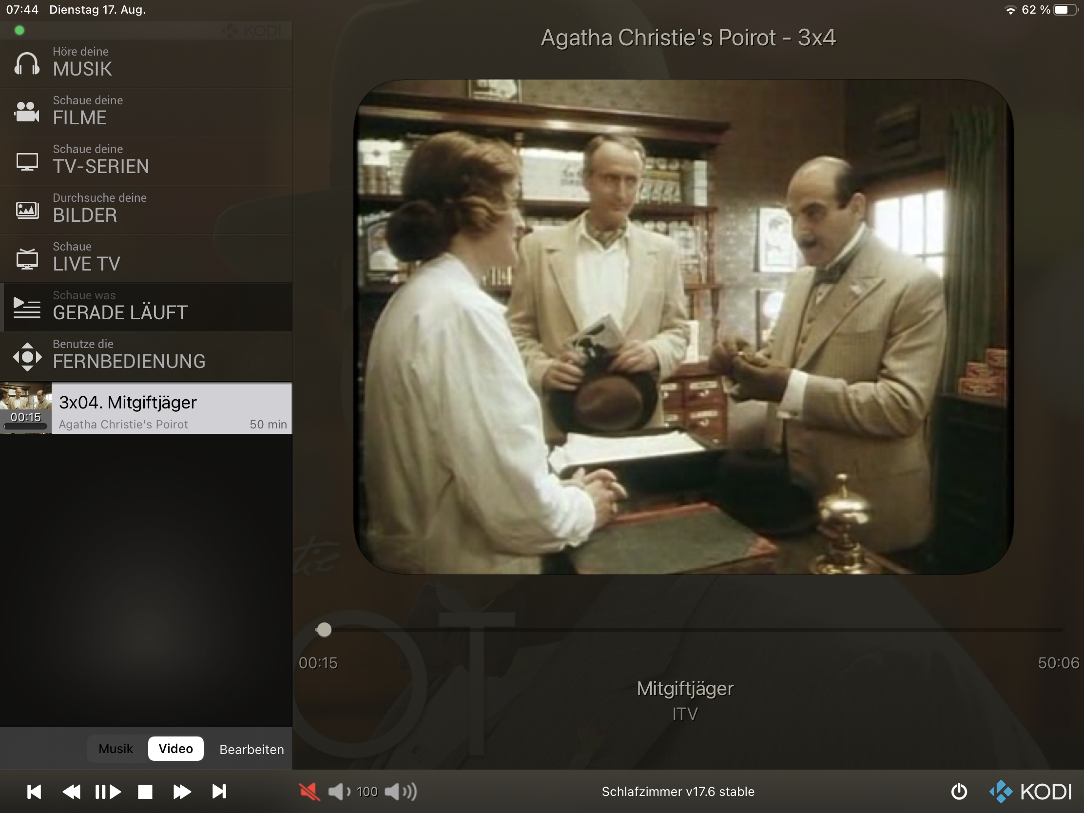
One current example which shows a look and feel that reminds me of a past time before I was born, when TV sets were 4:3 with large rounded corners (and that underlines why I think that these rounded corners do not add a modern look Smile
Image
Reply
That really looks like the good old tube TVs Smile

Current corner radius (10%)
https://abload.de/img/simulatorscreenshot-irjjb8.png (Music cover)
https://abload.de/img/simulatorscreenshot-i1jje0.png (4:3 TV)

Reduced corner radius (5%)
https://abload.de/img/simulatorscreenshot-ipcje1.png (Music cover)
https://abload.de/img/simulatorscreenshot-i2kjhx.png (4:3 TV)

Reduced corner radius (3%)
https://abload.de/img/simulatorscreenshot-ilxjdy.png (Music cover)
https://abload.de/img/simulatorscreenshot-iebkfo.png (4:3 TV)
Reply
  • 1
  • 20
  • 21
  • 22(current)
  • 23
  • 24
  • 156

Logout Mark Read Team Forum Stats Members Help
Testflight access to beta version0