Guest - Testers are needed for the reworked CDateTime core component. See... https://forum.kodi.tv/showthread.php?tid=378981 (September 29) x
  • 1
  • 21
  • 22
  • 23(current)
  • 24
  • 25
  • 156
Beta Testflight access to beta version
@Buschel, I would go for 3%, even less.

Another wish: do you think it is possible to add the number of audio channels (e.g. 2.0, 5.1, 7.1.2) to this "now playing" screen? And maybe the sampling rate, too? Would be of great value to know whether I selected the right audio track.
Image
Reply
(2021-08-17, 18:37)UlfSchmidt Wrote: @Buschel, I would go for 3%, even less.

Another wish: do you think it is possible to add the number of audio channels (e.g. 2.0, 5.1, 7.1.2) to this "now playing" screen? And maybe the sampling rate, too? Would be of great value to know whether I selected the right audio track.
Image
You seem to be not too much convinced of the rounded corners Wink

Technically the information you ask for is already present. But it will be hard to find the place in the layout which also works for the small screen devices.
Reply
(2021-08-17, 19:00)Buschel Wrote: But it will be hard to find the place in the layout which also works for the small screen devices.

You can simply ignore small devices Smile
Reply
(2021-08-17, 19:00)Buschel Wrote:
(2021-08-17, 18:37)UlfSchmidt Wrote: @Buschel, I would go for 3%, even less.

Another wish: do you think it is possible to add the number of audio channels (e.g. 2.0, 5.1, 7.1.2) to this "now playing" screen? And maybe the sampling rate, too? Would be of great value to know whether I selected the right audio track.
Image
You seem to be not too much convinced of the rounded corners Wink

Technically the information you ask for is already present. But it will be hard to find the place in the layout which also works for the small screen devices.
I find the rounded corners particularly disturbing in lists where one icon is directly placed after the other without any blank space, like it is done in list views. No big issue for grid view, but yes, please limit the amount of the rounding.

Maybe you can simply shift the Dolby or dts logo etc. a few pixels up and add the number of channels below?
Reply
(2021-08-17, 19:07)kambala Wrote:
(2021-08-17, 19:00)Buschel Wrote: But it will be hard to find the place in the layout which also works for the small screen devices.

You can simply ignore small devices Smile
+1 Smile
Reply
(2021-08-17, 19:09)UlfSchmidt Wrote:
(2021-08-17, 19:07)kambala Wrote:
(2021-08-17, 19:00)Buschel Wrote: But it will be hard to find the place in the layout which also works for the small screen devices.

You can simply ignore small devices Smile
+1 Smile
Maybe limit the amount of information for small devices and show such details only where you have enough free screen space?
Just an idea…
Reply
Ok, ok. Smile
I am somehow too much into consistency, it seems. I will look into adding more items, if the view width is allowing it. But not for the next release anymore.
Reply
@Buschel, back to the automatic background color selection, which is broken since the rounded corners?!

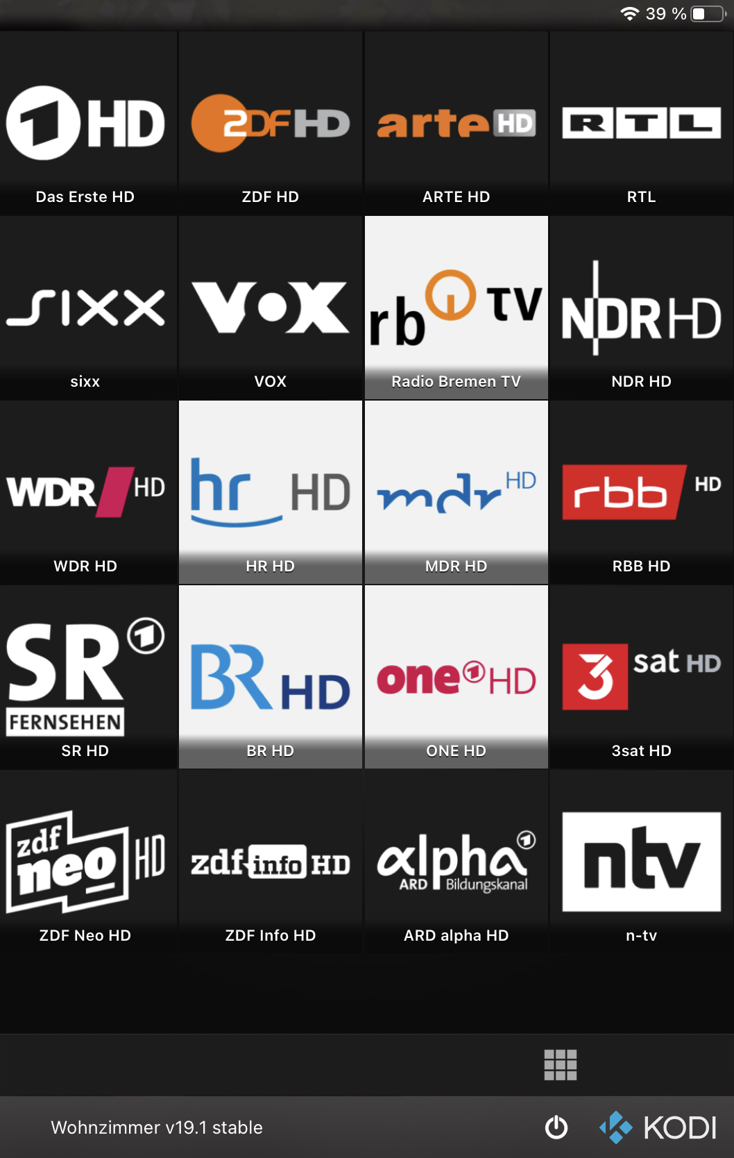
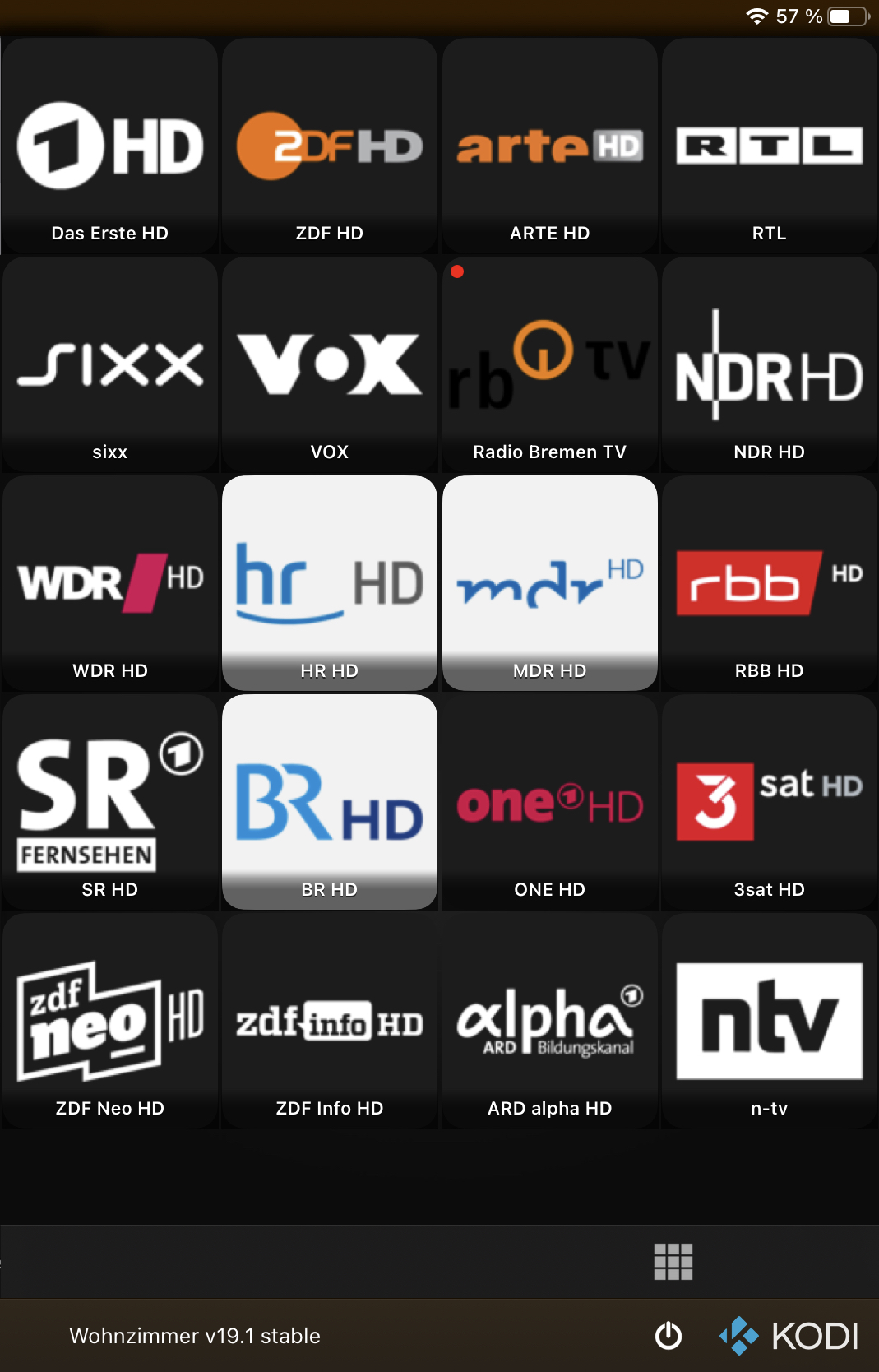
Old vs. current:
Image Image

Look especially at RB TV, but also ONE HD has a different rendering.
Reply
(2021-08-17, 19:37)UlfSchmidt Wrote: @Buschel, back to the automatic background color selection, which is broken since the rounded corners?!

Look especially at RB TV, but also ONE HD has a different rendering.
This is interesting. Are the screenshots comparing current App version with/without rounded corners? Or are these different builds?
Reply
(2021-08-17, 19:47)Buschel Wrote:
(2021-08-17, 19:37)UlfSchmidt Wrote: @Buschel, back to the automatic background color selection, which is broken since the rounded corners?!

Look especially at RB TV, but also ONE HD has a different rendering.
This is interesting. Are the screenshots comparing current App version with/without rounded corners? Or are these different builds?
These are different builds. But even with the current build, the images remain valid. Rounded corners "on" disturb your algorithm that computes the background color. Sad

One more reason for me to avoid rounded corners Smile
Reply
(2021-08-17, 19:52)UlfSchmidt Wrote:
(2021-08-17, 19:47)Buschel Wrote:
(2021-08-17, 19:37)UlfSchmidt Wrote:  
These are different builds. But even with the current build, the images remain valid. Rounded corners "on" disturb your algorithm that computes the background color. Sad
Confirmed. This is caused by the image processing added to mask the corners. I am looking into this right now.
Reply
1.7.2 build 2565
Release Notes

@UlfSchmidt, this reduces the radius to 3% -- a bit smaller than the last smallest one which was in fact 1/30. A solution for the automatic background selection for TV station logos when rounded corners are enabled, is also on its way.
Reply
Heart 
(2021-08-17, 21:47)Buschel Wrote: 1.7.2 build 2565
Release Notes

@UlfSchmidt, this reduces the radius to 3% -- a bit smaller than the last smallest one which was in fact 1/30. A solution for the automatic background selection for TV station logos when rounded corners are enabled, is also on its way.
Wow, thanks for this quick update!
I hope you confirm that this corner size looks so much better? Wink
At least I like it! Appreciate your work and open mindset (insbesondere weil manche doch gerne schnell angepisst sind, wenn man auch nur die Idee einer Kritik an ihrer open source Arbeit leistet Wink - frei nach dem Motto, man möge es dann doch bitteschön selber machen)
Reply
(2021-08-17, 22:21)UlfSchmidt Wrote:
(2021-08-17, 21:47)Buschel Wrote:  
Wow, thanks for this quick update!
I hope you confirm that this corner size looks so much better? Wink
At least I like it! Appreciate your work and open mindset 
Well, the "rounded corners" feature is all about personal preference. My stomach feeling was that the radius was too large in its initial state, now I made it even smaller than I was thinking of. But overall the users and not only me (Smile ) shall be comfortable using this, and I am fine with the look & feel of the latest beta version. Any many thanks again for your always appreciated feedback and testing time you put into the Remote App.

On the topic of the App layout for different screen sizes: It is obvious that the screen layout was mainly influenced by the iPhones (with smaller screens) several years back. You can see this especially from the way how the remote and the NowPlaying screens are designed. There is even some special code in the remote screen implementation to handle the very small screen of e.g. iPhone 4S which is still supported. Except the fullscreen solutions even the iPad follows basically the same screen layout -- just with in general wider screens.

The last remote screen changes already leave this limitation and use more of the available vertical space, but still keeping the special treatment for smaller devices. The additional vertical space is used for a toolbar and the volume slider. For larger devices you now can even move the remote buttons to the upper or lower part of the screen which should make it easier to use it 1-handed. In my opinion having the new toolbar and the volume slider on the remote screen really makes a difference as you now can reach all functions on the same screen which were (and for the small screen devices still are) spread over two screens.
For iPads I feel the remote screen looks weird -- too bloated, especially on the large screens. Maybe I will try to bring this into a popover style with a smaller size.

The NowPlaying screen layout is also limited by the size of the small screens of the older iPhone models. There is a lot of vertical free space left on newer iPhone models. This could be used for additional buttons (repeat, shuffle) or for more detail info like audio or video codecs, bitrate, number of channels, sample rate or bits per samples. These could possibly be removed from the detail view overlay. Other control point apps -- especially for audio -- have similar information / buttons on the NowPlaying screen. We just need to take care the screen does not become overloaded with information, and that we have several playback items with different needs (video, audio, recordings, radio, pictures, ...).
For iPads this is even more difficult. The screens -- depending on the orientation -- can even have less height but more width. Also I personally think that having the basic playback controls (play, pause, skip, ...) in a very small toolbar on the left, and not directly related to the NowPlaying screen, is not a good solution. This is becoming more obvious when looking at the devices with larger screens where the controls are really small and "lost" on the screen. I did not yet think through the options, but I feel the App layout on iPad can take some re-design.
Reply
@Buschel I can suggest v2.0 with complete UI overhaul (if you or someone from the forums feels like designing Smile ) and possibly getting rid of the smallest iPhone, i.e. require iOS 10.0
Reply
  • 1
  • 21
  • 22
  • 23(current)
  • 24
  • 25
  • 156

Logout Mark Read Team Forum Stats Members Help
Testflight access to beta version0