Guest - Testers are needed for the reworked CDateTime core component. See... https://forum.kodi.tv/showthread.php?tid=378981 (September 29) x
  • 1
  • 37
  • 38
  • 39(current)
  • 40
  • 41
  • 156
Beta Testflight access to beta version
I can just guess the text was chosen from a technical point of view. A command to get playlist items is issued, and the response is empty. "No items found." Btw, the same text is shown when entering any other empty list. Tailoring the text for different views is possible, but not economical. I somehow agree it could be more user friendly to display a different text especially for the iPad playlist, but I definitely would not really remove this. As you said, on iPad it is not obvious what the empty area is used for (on iPhone the NavigationBar title states "Playlist"). I am not convinced to change or remove the text only for playlists.

On the grey circle I cannot comment. I never found it in any way disturbing though, and just took this as an "eye candy" element to ease up the look.
Reply
It seems I somehow have to see for myself how things are done differently on the iPhone, since I quite often get the impression from your kind answers that on the iPhone everything I complain about is not only handled in another way, but always better, more consistent and much more intuitive.

But then I think for myself, why the f*ck aren’t the same things handled in the same way? What’s the benefit of doing things differently here? It cannot be just the bigger screen?

With respect to the playlists, I checked once again the previews available in the AppStore. Et voilà, for iPhones this ugly omnipresent playlist view seems to be missing. Wink

How is this done on iPhones? Is this a feature only available for iPads or is this an option like TV or Remote Control? Not clear for me from the previews provided, even when taking your explanations above into account.

Nevertheless, I still find a text saying "No items found" rather misleading in this context from end user point of view. Especially since it is (for me since I patched my skin) initially shown right after startup of the App in an otherwise nondescript area. I know what this all means, but a user who isn’t a programmer may find this confusing, I’m very sure.

So thanks again considering an update here…
Reply
I remember we had a discussion about the iPad/iPhone design earlier this year in this thread. The App was obviously designed for iPhone, and then later adapted for iPad. The following makeshift view shows how the iPad UI is basically constructed from the existing iPhone views. Difference ist that the iPhone has the Navigation bar and the toolbar in each screen (1, 2 and 3), on the iPad you have this obviously only once for the whole screen (4 and 5). Therefore the name for each view is not shown and elements of the iPhones toolbars are partly merged into the iPad toolbar. Benefit for iPad (not everything is better on iPhone) is that the bottom toolbar is always there and allows the same interaction.

Btw, you can also see that the iPhone has the same "No items found." text for its playlist screen. Wink

https://abload.de/img/bildschirmfoto2021-128okot.png
Reply
(2021-12-23, 10:11)Buschel Wrote: I remember we had a discussion about the iPad/iPhone design earlier this year in this thread. The App was obviously designed for iPhone, and then later adapted for iPad. The following makeshift view shows how the iPad UI is basically constructed from the existing iPhone views. Difference ist that the iPhone has the Navigation bar and the toolbar in each screen (1, 2 and 3), on the iPad you have this obviously only once for the whole screen (4 and 5). Therefore the name for each view is not shown and elements of the iPhones toolbars are partly merged into the iPad toolbar. Benefit for iPad (not everything is better on iPhone) is that the bottom toolbar is always there and allows the same interaction.
Thanks @Buschel, for taking your time to explain this. Smile
Quote:Btw, you can also see that the iPhone has the same "No items found." text for its playlist screen. Wink
Yes, I see, but the major and important difference is that it states the word Playlist above on iPhones. On the iPad, that’s the core of what I was exactly complaining about, there is only this text shown, but without any context. That’s why I asked for a different text here, like e.g. "Empty playlist".
Or you may add a small headline above the playlist area on iPads, reading "Playlist".

(Fair enough, it seems to me that I am the only one worldwide having this "issue". So we should not spend too much time on this. Wink )
Reply
@UlfSchmidt 

Is this what you have in mind? Screenshot: https://abload.de/img/bildschirmfoto2021-12f9jef.png
Reply
Thumbs Up 
Exactly. Smile
And since the top bar with the connection status light will also go in future versions, this addition should also not cause any sizing or other layout issues.
Reply
Next bigger rework I started will update the playlist handling. I was always wondering about some weird behaviour when testing the playback of pictures / picture shows. The simple reason was that only two types of Kodi playlists were supported (Music and Video), the third one (Pictures) was more or less ignored. The rework adds the support for this third playlist type, which requires the segment buttons ("Music", "Video") to use icons instead of text due to layout constraints. During this work I also could fix a few issues reported from users (issue #477) and that were hard to reproduce (missing time/duration in NowPlaying screen, German translation). More details and screenshots can be found in GitHub PR #539.
Reply
A highly appreciated further useful advancement that I haven't had the courage to ask for… Wink
Thanks @Buschel !
Reply
@Buschel :

By the way, will it then eventually be possible to control the pictures shown via the remote control buttons when in Pictures Playlist mode and alternatively to control the music running in parallel when in Music Playlist mode?

And what is also urgently missing is a long-press menu on pictures including the option to start a slideshow from the current picture. And obviously to add a single picture to the picture queue… (implemented in the same way as it is already done for music or movies, i.e. "add next" and "add to the end").

But maybe you have already all this in your current to-do-list? Wink
Or even already implemented?
Reply
The pictures playlist behaves a bit different than the other playlists. For example you cannot apply "Queue after current" to a picture, but you can "Queue" a picture to the end of the playlist. I already implemented the actions "Queue" and "Play" for picture files. About the slide show I am not clear if the API allows this. At least you can now add single picture files to the end of the playlist and run a slideshow from there, starting it with a "Skip Forward" command. I will need to dig deeper into this ...
Reply
(2021-12-31, 13:43)Buschel Wrote: The pictures playlist behaves a bit different than the other playlists. For example you cannot apply "Queue after current" to a picture, but you can "Queue" a picture to the end of the playlist. I already implemented the actions "Queue" and "Play" for picture files. About the slide show I am not clear if the API allows this. At least you can now add single picture files to the end of the playlist and run a slideshow from there, starting it with a "Skip Forward" command. I will need to dig deeper into this ...
Wouldn’t it be more natural to use Play to start a slideshow from the current image, not Skip Fwd? (Comparing the behavior for consistency with music playlists) - or is this also API related and cannot be circumvented?
But I know, Christmas is over and so is the time for unrealistic wishes…
Reply
This is what I am looking for. Oh and I did not implement it like this -- it just behaves like this. Smile
Btw, in the meanwhile it is possible to queue/play a complete folder.
Reply
Happy New Year @Buschel and everyone loving the Kodi Remote App!

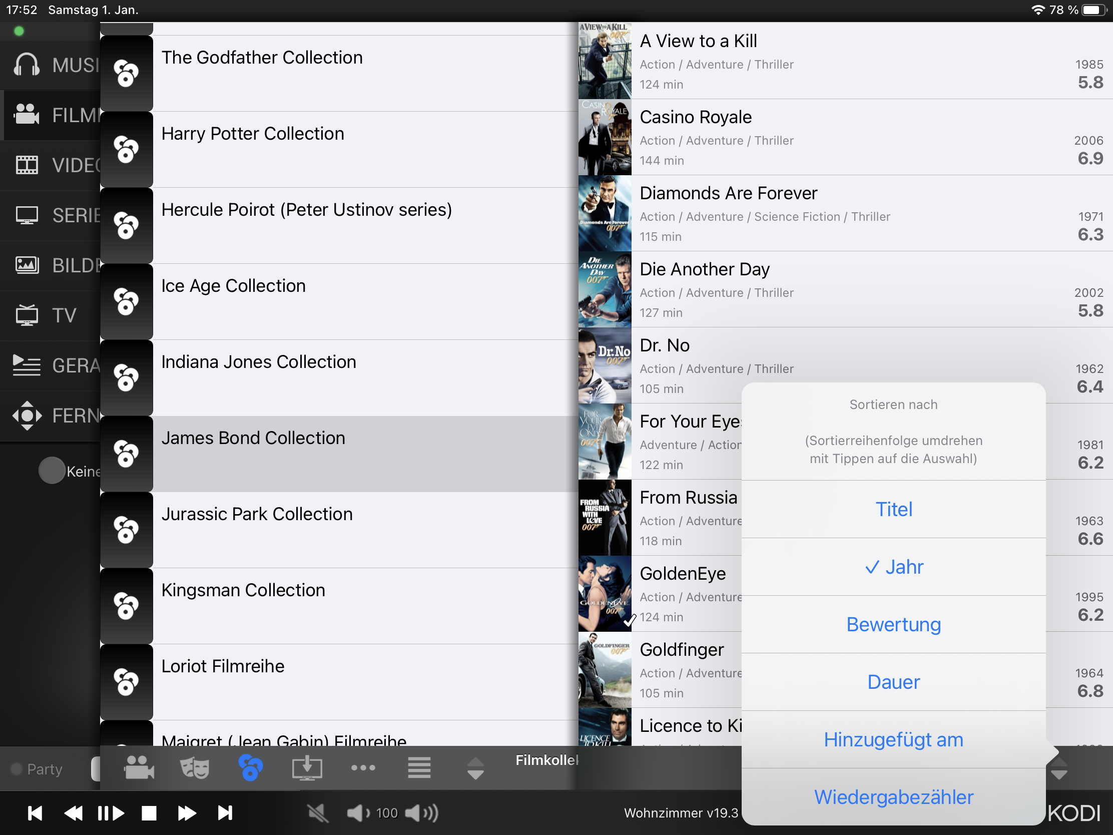
I just stumbled upon a very minor glitch: Despite having selected "order by date", my movie collections are listed alphabetically:
Image
Only if I sort them in descending order, they will be listed chronologically - but obviously with the youngest movie first…
Reply
Confirmed. From what I can see this is a bug in Kodi itself. Even though the App requests sort by "year" Kodi responds sorted by "label" when filtering for movie sets. As the App does not locally apply any kind of sort when the desired sort method is the one requested from Kodi (in this case "year, ascending"), you cannot sort by year in ascending order. But, it will work in descending order. I will add a workaround for this, by simply requesting a default sorting by "label" for movies inside movie sets. In this case the user can filter for year in ascending or descending order.
Reply
Thanks!

What really bothers me is that, if I remember this correctly, it worked already flawlessly at some point in time in the past.
And that these year labels are not shown in the App when sorting by year ascending is selected… this cannot be the result of the API delivering the results wrongly sorted?
Reply
  • 1
  • 37
  • 38
  • 39(current)
  • 40
  • 41
  • 156

Logout Mark Read Team Forum Stats Members Help
Testflight access to beta version0