Guest - Testers are needed for the reworked CDateTime core component. See... https://forum.kodi.tv/showthread.php?tid=378981 (September 29) x
  • 1
  • 41
  • 42
  • 43(current)
  • 44
  • 45
  • 156
Beta Testflight access to beta version
1.10 build 3060
Release Notes

This build brings some bugfixes and optimization mainly related to discussions and suggestions from this thread. You will find details and screenshots in the Release Notes' links.
Reply
@Buschel

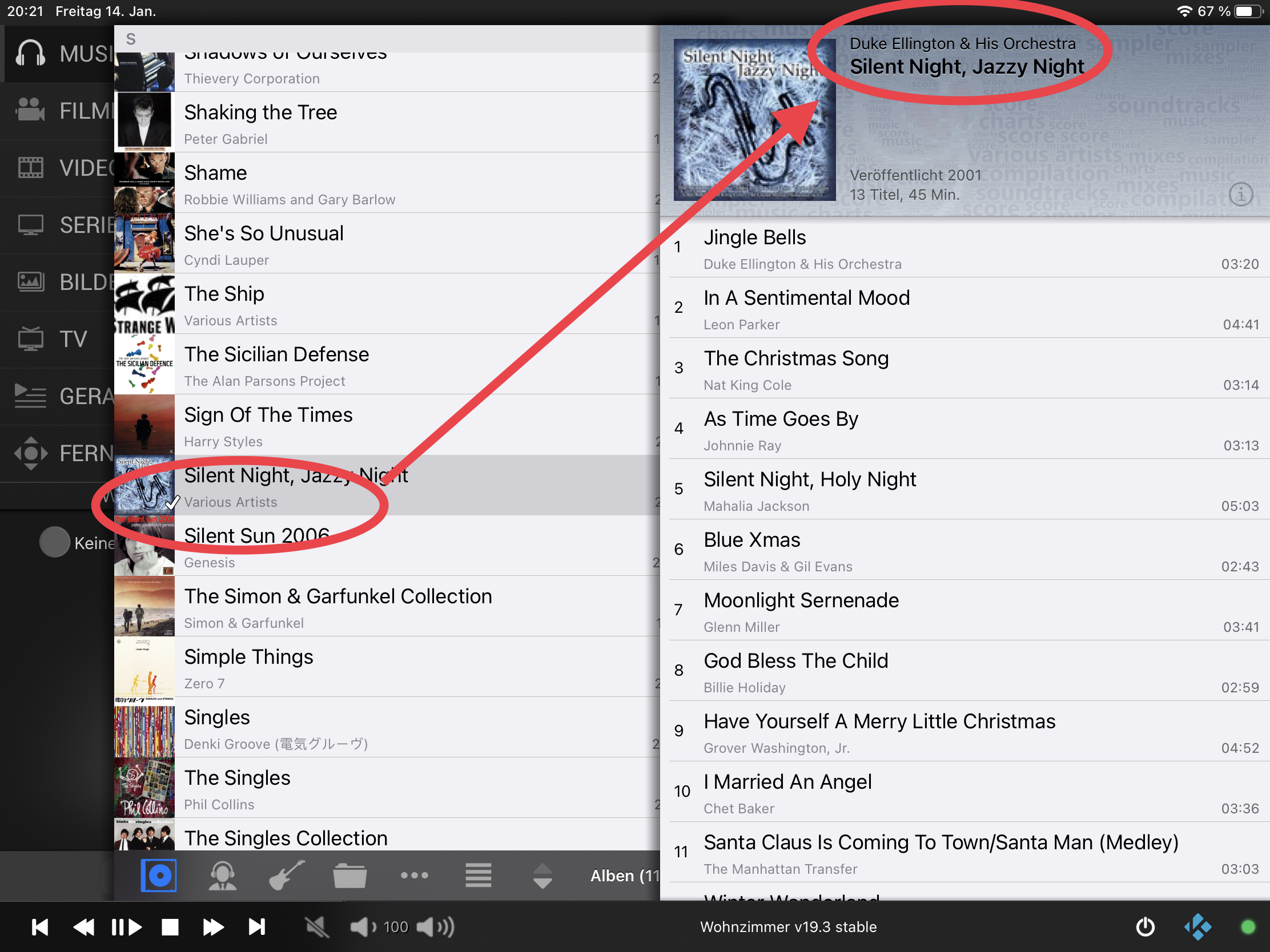
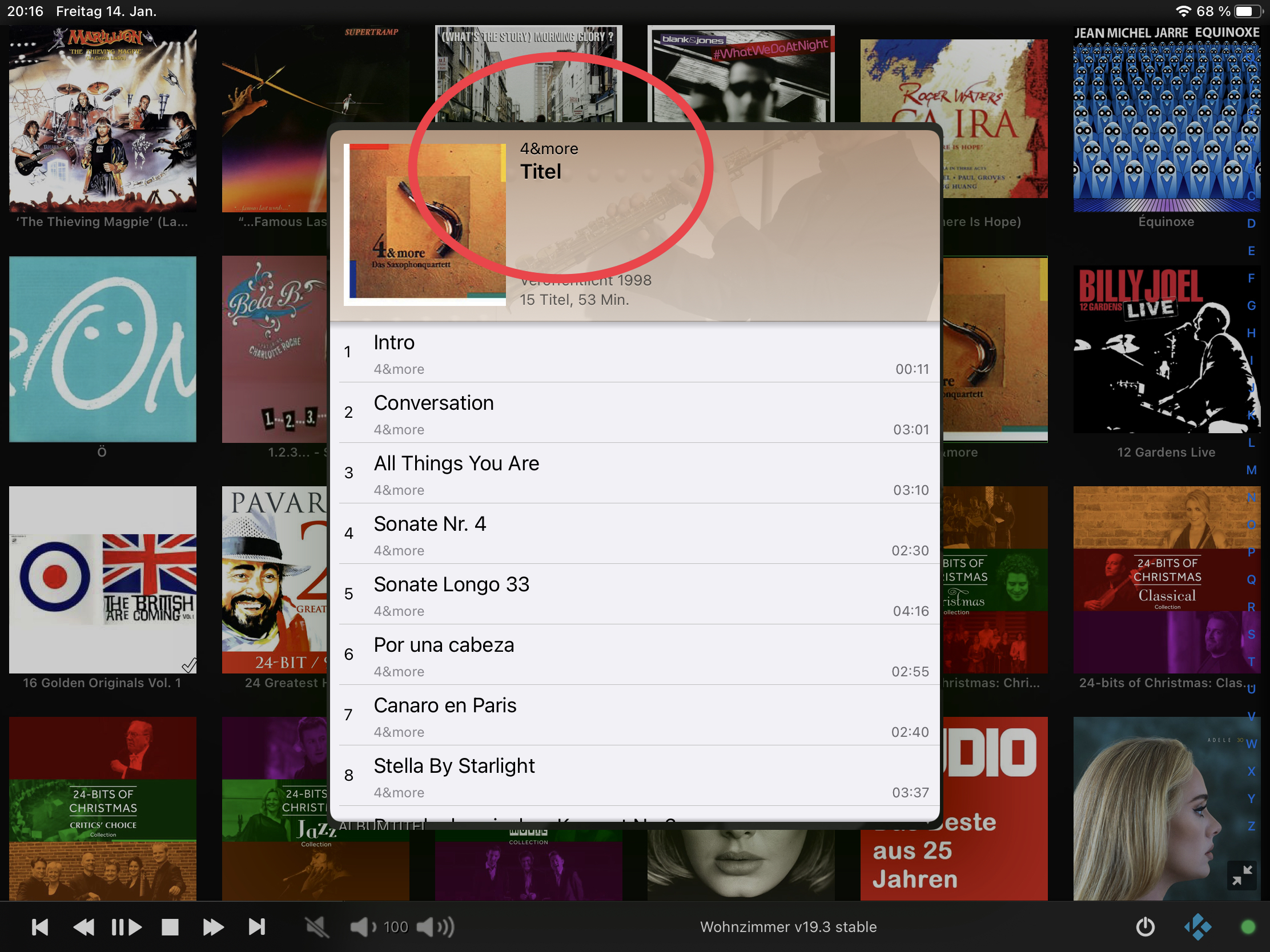
Some minor findings still exist:

Image
Titel? Wink

Image
Please show the album artist also in the view on the right (and in the other view shown in the first image), not the artist of the very first track.

Thanks! Smile
Reply
Thanks, @UlfSchmidt. There are simply too many options ... I have solutions for both (see #558). But there might still pop up other glitches. I will test this a bit further, but finally that's what the beta builds are created for. Wink
Reply
@Buschel

Thanks for another beta.

So a few things I’ve noticed.

1) All of a sudden I started getting a popup on the app concerning TCP. I’ll attach that below. I tapped to enable it and my connection turned green.

Later when I used Kodi I noticed it reset. I went into actual Kodi settings and enabled the setting you mentioned several posts back to enable proper TCP connection and all seems well now. Still, it’s strange I was getting a dialog in the app. Is this something new?

Image

2) A second thing concerning enabling TCP. I was able to trigger another bug that I was finally able to reproduce. In certain contexts where Kodi asks for user input the remote app keyboard will actually display the input text context. For example, if you try to add a new file source in Kodi you can enter a name for the media source. If you select this box from the app, the keyboard is brought up and the same text prompt is displayed in the app. However I think this text should be white. It’s currently black which is really hard to read and may be an artifact from when the color scheme was different? I’ll attach a screenshot of that too. Note this context text only appears when you have a proper TCP green connection.

Image


3) I tested the keyboard dismissal you implemented per my previous find. This gets dismissed correctly now but there are some inconsistencies.

When you swipe to the left pane it dismisses the keyboard. When you swipe back, the search box is not activated and the keyboard does not show up. This is expected. However if you activate the search box, bringing up the keyboard, and tap the remote icon bringing the remote control into view from the right, and swipe back it will reactivate the search box and bring up the keyboard again. I don’t think this is intended.

4) I’m not sure if this changed or not recently but I was playing with the Kodi server settings screen where you enter IP, user name & password etc and found this to be incredibly difficult to navigate. I’m not sure if the cursor is simply black or if there is even a cursor at all. You really can’t tell which box is selected until you start typing. I’m not sure how much work it would be but the text is rather small here too. May I go the padding could be reduced slightly on the sides. Too my eye it also looks like there is a slight amount more padding on the left side than right. Yes, this is a major nitpick. 🙂
Reply
(2022-01-15, 01:59)Buschel Wrote: Thanks, @UlfSchmidt. There are simply too many options ... I have solutions for both (see #558). But there might still pop up other glitches. I will test this a bit further, but finally that's what the beta builds are created for. Wink
Very good. Thanks once more for taking care, even late at night!
And sure. This is the reason for beta testing and I am more than happy to contribute.
Together with @amasephy , who diggs into completely different areas of the App, those I rarely use, we will find even the smallest glitches Smile
Reply
(2022-01-15, 03:53)amasephy Wrote: 1) All of a sudden I started getting a popup on the app concerning TCP. ...
I was also seeing this only since I was deactivating the TCP connection. This pops up until you either activate TCP or you select "Never show me again" or something like this. Maybe you did this in the past?
(2022-01-15, 03:53)amasephy Wrote: 3) I don’t think this is intended.
Well, I wanted the search to become active again when you select an item from the filtered list and go back. I guess this is what you see.
(2022-01-15, 03:53)amasephy Wrote: 2) ... It’s currently black which is really hard to read and may be an artifact from when the color scheme was different? ....
4) ... I’m not sure if the cursor is simply black or if there is even a cursor at all. ...
Nice catch! The Dark Mode adaption was not fully done in these cases. I fixed this in PR#565 (screenshots included there).
Reply
1.10 build 3084
Release Notes

This build provides some fixes and improvements for the issues reported by TestFlight users (iOS 10 problems with main menu, wrong text in album view or bad readability in Dark Mode). In addition, some features were added to show more information in the playlist view.
Reply
@Buschel

Just a quick test but it looks like the server screen is good now.

For the context label for text input it doesn’t seem to bring that up anymore? My go to test is to enter a name for media source and now the keyboard isn’t brought up when I enter this. Manually bringing up the keyboard doesn’t display that text box label either. Did this change?

Edit: tested again and now it worked correctly. Strange, the first time simply refused to display the keyboard and label.

Both look good.


Found a new bug playing with the search box in movies at least, probably the same problem for the other categories too.

You can completely break the search box and have to force quit the app to fix.

Steps to reproduce:
Go to movies on the app.
Pull down the search box.
Type any letter
When search results are displayed attempt a resync by swiping the list down.

Now you will see one minor bug, the first item is half cutoff.

The bigger bug is that you can no longer dismiss the keyboard! The cancel button doesn’t work. You can swipe back to the left main menu screen to get rid of it but once you go back to the list and attempt a search the same problem persists. Until the app is restarted the cancel button won’t work.
Reply
(2022-01-17, 05:08)amasephy Wrote: Both look good.
Thanks for confirming.
(2022-01-17, 05:08)amasephy Wrote: You can completely break the search box and have to force quit the app to fix.
Yes, I remember this one. This issue exists since the very first time I got the App running under iOS 14 again (version 1.6). But you do not need to restart the whole app. It is enough to just re-enter "Movies" from the main menu. This is why I was not giving it priority yet. I will look at this again as I am now a bit deeper in the code. Wink

Edit: And fixed. Was really a lot easier to find this now.
Reply
@Buschel

Glad it ended up being an easy fix.

Found three new bugs today. 🙂

These have to do with the playlist functionality.

Steps to reproduce.

1) Party label remains viable.
- navigate to the playlist via the quick access button from movies for example.
- make the whole playlist visible
- make sure the movies category is selected in the “radio button” at the bottom.
- swipe back slowly to reveal the movie pane.
- Here you will see a ghost of “Party” which is actually a label for the music mode in the playlist pane.

* Note this is not a problem when accessing the playlist pane from the main menu.


2) While I’m queue view of the playlist if you swipe back partially to previous screen but don’t let go and instead keep the queue list visible it will revert back to the currently playing screen in the playlist instead of keeping the queue view active even though you haven’t really changed panes.


3) Queue up a couple of movies into a playlist. While in the playlist queue view select edit.
- Now try swiping to the remote on the right. You will find that you don’t even need to swipe. It just immediately reveals the remote upon any sliding gesture.
- You will also find that sliding back to the queue view does not work. You need to tap the partially revealed playlist pane to go back.
Reply
Thanks, again interesting findings.

1. Already fixed. Nice catch.
2. Confirmed, and following the desired implementation. The view will always fall back to the NowPlaying screen if it is becoming visible. This is also triggered when snapping back. Not sure yet, if this is easy to change, there is some logic with state variables behind it.
3. Confirmed. Here I am also not yet sure where to look at.
Reply
@Buschel

Thanks. Some of these are pretty obscure. 🙂

So I just found another one. I hadn’t used the favorites category on the app before but believe it’s somewhat new?

In either case there is something strange happening when navigating to it.

For lack of a better word I’m going to call the two views “list” and “block” where block is more of a square and list is the full row.

Set favorites to “block view”. This should persist.

Navigate elsewhere in the app.

Now navigate back to favorites. For a split second you will see this screen flash to the left. I believe this is actually the list view being slid out of the way. When you flip between both views you will see the same animation.

I don’t believe this should be happening when favorites is on block view and you just navigate to favorites. It’s almost like while favorites persists the chosen view type, behind the scenes it always defaults to list view and then quickly changes to block if that is the current setting.


Edit: another favorites bug.

You can make the search box disappear.

-Set favorites to list view.
-
Now scroll down on the list. (You don’t have to have more than one item). Just go through the motion.

- Change to block view.

- Attempt to reveal the search box. It won’t be there.

- This does not happen with the other view.
Reply
The "block view" is called "wall view" or "grid view". Wink

1. Animation
The shortly visible animation I can also see in other menus (e.g. Music). I can take a look at this, but I am not too much bothered about this for now.

Edit: I recorded a video and checked it in slow motion. Test sequence: Go to Music and have it in list view. Then go back to main menu and select Favourites (which will restore grid view). Outcome: There is no unwanted content. First, the empty panel is sliding in from right to left, then the grid view content is following. Maybe the two-step animation causes the reception of something different is shown.

2. Search bar
I cannot reproduce the missing search bar based on your description, but I found another way: Enter grid view, then in quick sequence switch to list and again grid view. Now the bar does not show, but it will react when clicking into the gray area. I know this issue from the bringup of the search for grid view. This happens when the grid view is brought up without removing the search bar from the list view before. I am quite sure this is a race condition.
Reply
@Buschel

Thanks again for looking at these extremely minor issues.

I was thinking today about how I actually use the app. May I suggest a feature?

Right now upon launch and connection to a Kodi server the app will display the main menu. Most of the time I simply use the remote control. I’m wondering if an option could be added to the settings where you could set a default pane. Options like main menu, remote, now playing etc.
Reply
(2022-01-18, 19:45)amasephy Wrote: Thanks again for looking at these extremely minor issues.
You're looking into areas I didn't test too deep. So, I am thankful for this and this helps making the app and user experience better.
(2022-01-18, 19:45)amasephy Wrote: I’m wondering if an option could be added to the settings where you could set a default pane. Options like main menu, remote, now playing etc.
This is a good idea, and this was raised before -- only for Remote screen, but of course this could be made configurable for other menus as well. Technically this is for sure possible. I just need to see how to implement this, and I need to make up my mind how to handle a configuration where the user selected a main menu as default screen when the same is not enabled in the main menu configuration itself. I am having something else to work on for now, but I will move this to the backlog.
Reply
  • 1
  • 41
  • 42
  • 43(current)
  • 44
  • 45
  • 156

Logout Mark Read Team Forum Stats Members Help
Testflight access to beta version0