Guest - Testers are needed for the reworked CDateTime core component. See... https://forum.kodi.tv/showthread.php?tid=378981 (September 29) x
  • 1
  • 53
  • 54
  • 55(current)
  • 56
  • 57
  • 59
Release Confluence ZEITGEIST (Kodi 17-22)
Thanks @axbmcuser, awesome work!!! the "TV shows are displayed as single Episodes" option works perfectly.

Not sure how much work this would require or if it would mess up other things up, but a feature request would be allowing to move the main menu and widget towards the bottom of the screen, allowing better visibility of the backgrounds.
Reply
Actually trying to imagine how to it would look towards the bottom, It would probably be too low and it's actually perfect the way it is.
Reply
@Marklar Thanks for the info! :-) Glad it works.
 
Quote:Not sure how much work this would require or if it would mess up other things up, but a feature request would be allowing to move the main menu and widget towards the bottom of the screen, allowing better visibility of the backgrounds.

Just to be on the same page:

- We're talking about an option which would require all home screen "Add-on shortcuts" to be disabled/replaced - correct?

- If yes: I had some thoughts about such option some time ago and made a mockup in photoshop and was not really convinced by the test results.

Just made some new tests a few minutes ago in the skin itself and yeah - still not sure.
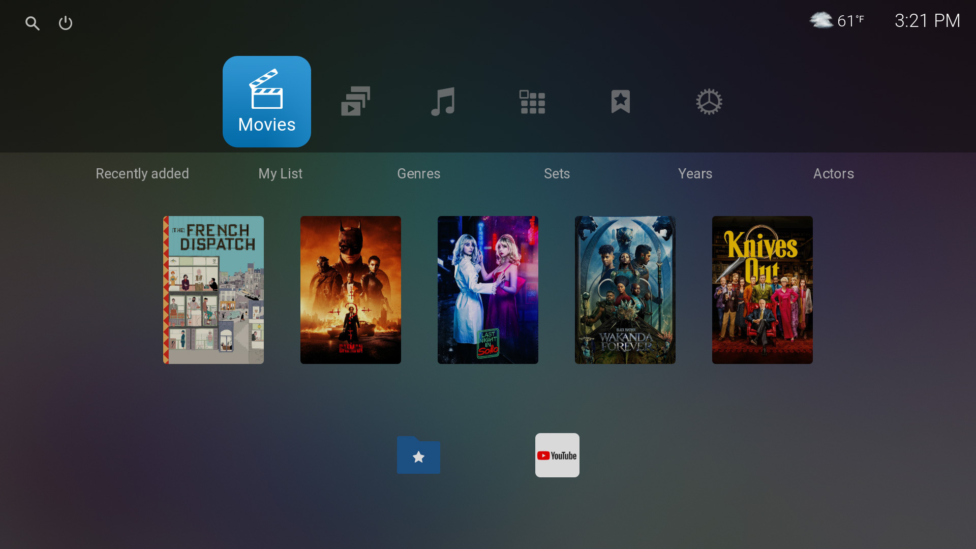
It kinda? works but also looks weird with all the heavy visual weight of all the elements being at the bottom. (Might be even more extreme when having a fuller main menu than in this example)

Also, as you might notice, the fanart isn't really _that_ much more visible than before. Mainly it's the position of the visual operlap that is different.

Of course it could help to if the user has some specific home screen background which profits from more visibility. But if that's worth the overall implications/sacrifice?
But since it would be optional, i'd might be a more valid idea.

Hmm. Not fully sure yet. I'll have some more thoughts.
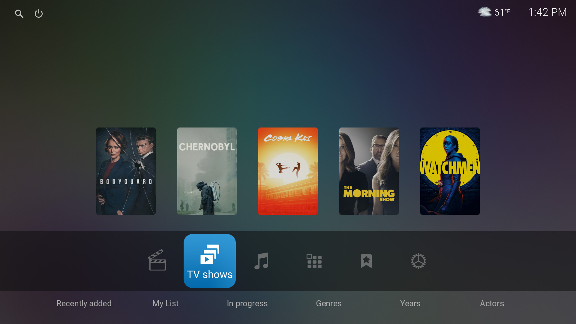

Image


Image
⬅️⬅️ Leave 👍 on useful posts  ·  axbmcuser REPO (Easy install)  ·  Confluence ZEITGEIST (intuitive UI for Kodi)
Reply
@Marklar

My comment about the home screen wallpaper users lead to some further thoughts:

The option might open up the specific possibility of improvements for users which don't at all want any widgets or add-on shortcuts on home screen and want to focus on a wallpaper.

Examples:

Image

Image

Image
⬅️⬅️ Leave 👍 on useful posts  ·  axbmcuser REPO (Easy install)  ·  Confluence ZEITGEIST (intuitive UI for Kodi)
Reply
@Marklar

...and mixing it up completely, something like this would also be worth a try:

Image
⬅️⬅️ Leave 👍 on useful posts  ·  axbmcuser REPO (Easy install)  ·  Confluence ZEITGEIST (intuitive UI for Kodi)
Reply
...all this spawned many new ideas for the home screen.

Even if we don't end up with a single "bottom" mode - this will be good i think! Thanks for the inspiration. :-)
⬅️⬅️ Leave 👍 on useful posts  ·  axbmcuser REPO (Easy install)  ·  Confluence ZEITGEIST (intuitive UI for Kodi)
Reply
Star 
Worked on stuff yesterday:

Step 1)
(already WIP)
- Home screen rework with an improved, more pleasent/simplified (still) centered look
- Created the groundwork for support of additional "top" and "bottom" home screen variants

Step 2)
- Creating and maturing new "top" and/or "bottom" home screen variants
(This will take quite much additional work until it'll really look & feel right)


All in all a good idea which caused me to finally do the home screen improvements i had on my list for some time.
⬅️⬅️ Leave 👍 on useful posts  ·  axbmcuser REPO (Easy install)  ·  Confluence ZEITGEIST (intuitive UI for Kodi)
Reply
Information 
New releases now online for all Kodi generations 18-22 (17 will be following)

Since ~80 files were changed, feedback that everything is fine is even more welcome than usual.


I took extensive measures so that all releases most likely are very clean and should not have unexpected issues - but you never know! Smile


Code:
6.7.20 (2024-06-08)

Home screen Rework (visual/functional)

- Reworked main menu
- Reworked sub menus
- Reworked home screen widgets (Movies, TV shows, Music, PVR, Favorites)
(Includes, but not not limited to: Recently added TV shows widget now default to the recently added "group by show" instead of showing single episodes)
- Reworked RSS feed support (improved, simplified and removal of rss icon)
- Groundwork for a future support of home screen styles

Global visual improvements

- Reworked dialog backgrounds
(dialogs, notifications, volume, extended progress, fullscreen VideoOSD/MusicOSD sub menus)
These elements are now cohesive with similar or identical shadows/glows

- Reworked and simplified CommonNowPlaying indicator and it's occurence (only visible on home screen)

Video info dialog Rework

- Reworked visuals for all media types of this dialog (Movie, TV show, Episode, Season, PVR) [DialogVideoInfo] [DialogPVRInfo]
- Added seasons support (see "Kodi 21+ only" section below)
- Music videos support improved
- The Trailer search button is now also shown for TV shows
- Groundwork for an adapted future cohesive "Music info dialog"

Misc improvements

- Added missing VisibleChange animation within MusicOSD for fullscreen darkening element

- Improvements for Skin settings "main menu" section
The functionality for moving the favorites menu item is now more noticeable and more intuitive to use due to the changes and an added up/down arrow.
Also slightly affects the "power options" section

- Added skin settings option to separately hide the video rating stars ("Show stars (*****)")

- Fixed missing audio passthrough volume icon in [DialogVolumeBar]

- Changed some possibly invalid comment tags in [DialogSeekBar] (Just to be safe)

- Slightly increased blue header label height for System/settings so it does not get so visually close to the below line/setting [SettingsCategory]

- Changed [MyPVRChannels] scrollbar nav target when going from right to left

- Corrected Player.Art(thumb) to Player.Art(icon) for TV channel icon in VideoFulllScreen (Fixes missing tv channel icon when playing recordings)

- Changed variable name TvShowEpisodePlayerArt to TvShowEpisodeOrMoviePlayerPoster due to recent changes and it's use (For consistency only)

- Improvements for "Fanart" view (movies/albums): "..." element is now hidden when unneeded (if description text is not shortened)
Cohesive with latest video info dialog changes

- The very bright yellow rating stars (video/music/...) are now slightly dimmed so they don't visually stick out with their intese brightness
Additional reasoning: Since fixating on media ratings is hugely escalated and overrated these days, the stars should not be the most bright and prominent visual element

- Fix PVR channel manager dialogs dialog background width (Width was slightly off; most likely the last minor regression of a previous dialog rework)

- Removed two empty fallback attribute for deprecated view MediaListView2

Textures:

- Corrected very slightly wrongly scaled "DefaultDVDxxx" disc icon textures (Middle of texture was slightly off center. Almost unnoticeable)
- Renamed two existing diffuse textures for user account pictures (For consistency only)

Kodi 21+ only:

- Added compatibility improvement with Kodi 21+ by also considering "favouritesbrowser" in addition to "favourites" [Custom_1170_IdleScreenCheck] [_includes]

Video info dialog

- Added support for TV show seasons
⬅️⬅️ Leave 👍 on useful posts  ·  axbmcuser REPO (Easy install)  ·  Confluence ZEITGEIST (intuitive UI for Kodi)
Reply
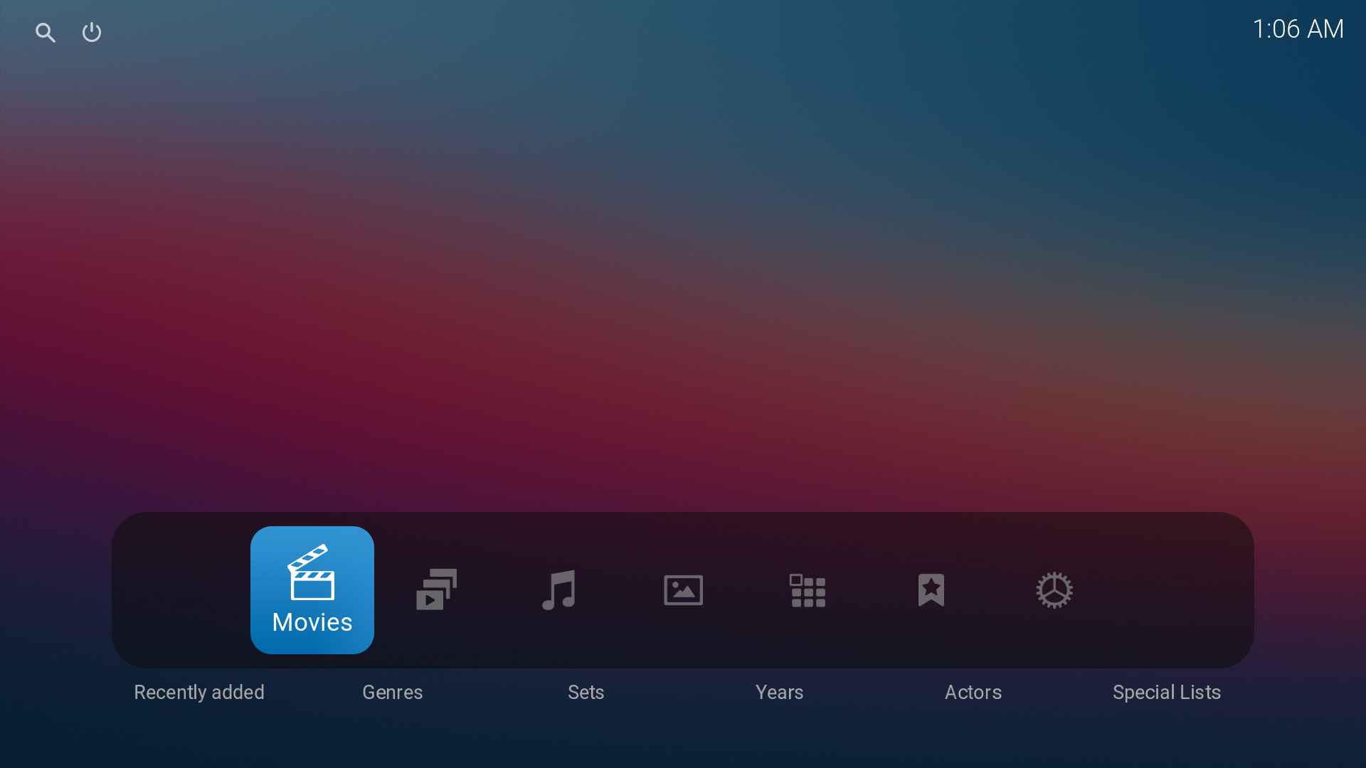
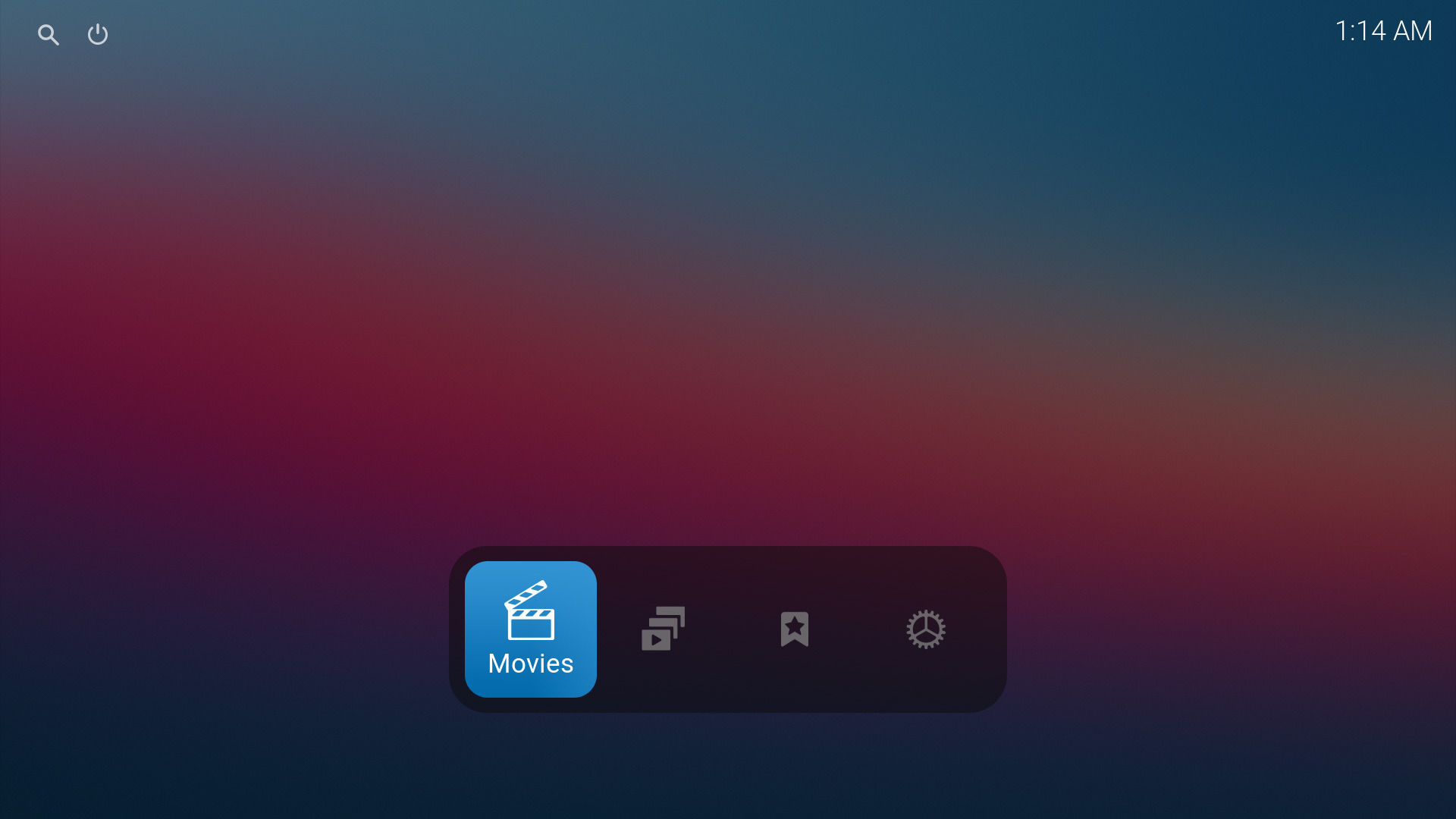
The new background in the main menubar looks kind of weird with the large empty space on the sides. Was that meant to end with the icon width on the left and right sides but you had more icons enabled? Would probably be better to align it automatically to the amount of icons (or have a manual option for the width which defaults to one matching the amount of icons. That could even let people revert it to the old full with bar if they prefer that)

Image
Reply
@The_Moep

I'll follow up on this. Have a nice sunday. Music
⬅️⬅️ Leave 👍 on useful posts  ·  axbmcuser REPO (Easy install)  ·  Confluence ZEITGEIST (intuitive UI for Kodi)
Reply
@The_Moep Check out just released version 6.7.22. I lack time today for a more specific reply but changelog should help for now.

@all

New releases now online for all Kodi generations 18-22 (17 will be following)

Code:
6.7.22(2024-06-09)

Home screen Rework (visual/functional)

- Further updates to main menu

- Added two new Skin setting options:

 * Home screen options - "Main menu background style" (Default: "Standard width")
   
   "Standard width"  Background width stays at 10-items-width for 10+ items and 9-items-width for 1-9 items
   "Reduce to item width"  Background width is reduced to the smallest possible size depending on the number of items
   "Full width stripe"  Background width is expanded to a full screen width stripe

 * Home screen options - "Show sub menus" (Default: On)
   New option to hide all sub menus on home screen without enabling Kiosk Mode (Kiosk Mode option remains intact and is mostly unchanged)

- Improved Skin settings structure of "Home screen options"
- Improved Skin settings "Kiosk Mode" option to consider the existence of the new "Show sub menus" option
⬅️⬅️ Leave 👍 on useful posts  ·  axbmcuser REPO (Easy install)  ·  Confluence ZEITGEIST (intuitive UI for Kodi)
Reply
@Marklar

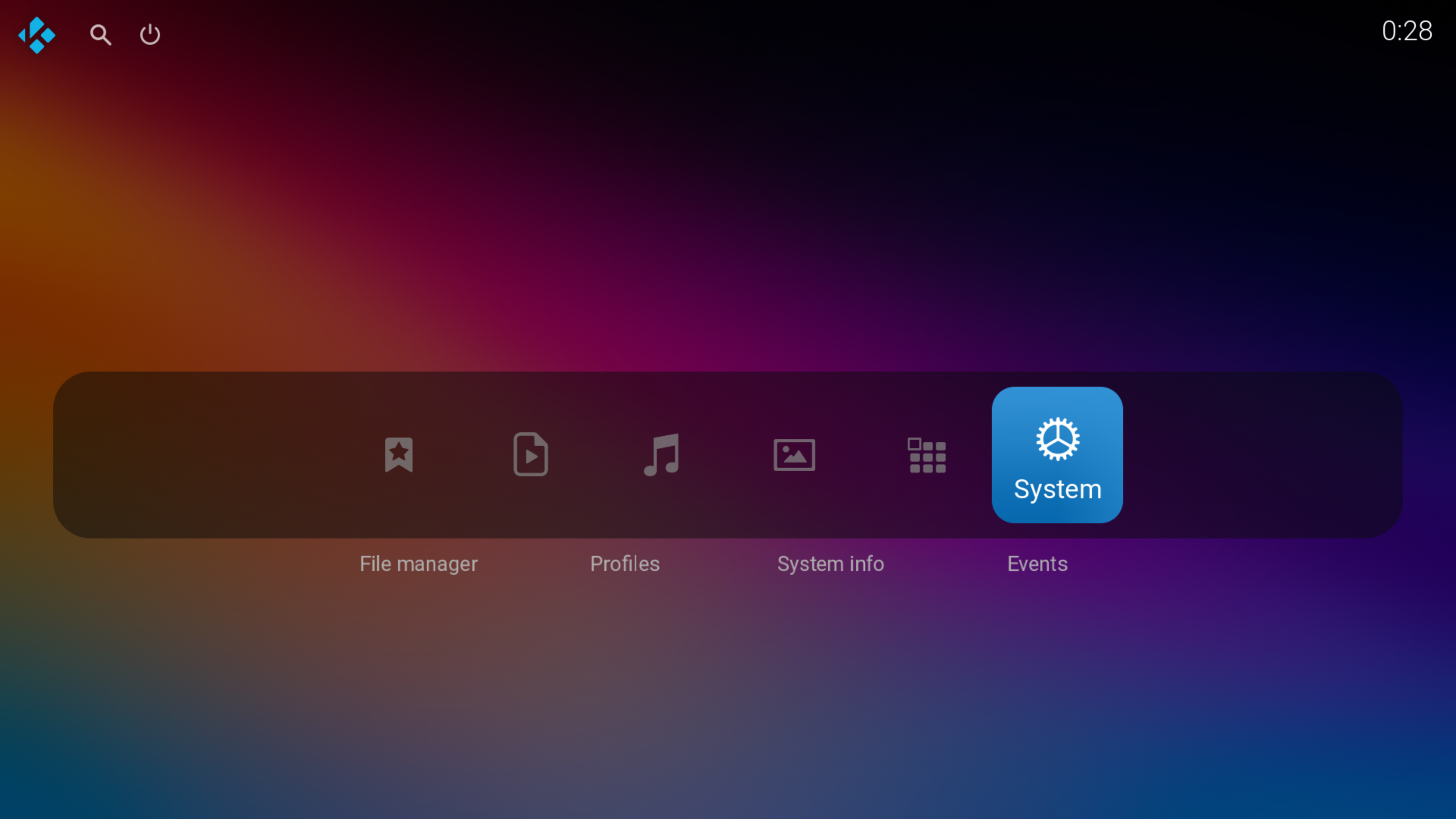
Have a look at just released version 6.7.23 featuring "Home screen styles" which change the vertical position of the main menu.


@all

New releases now online for all Kodi generations 18-22 (17 will be following)

Code:
6.7.23 (2024-06-11)

Home screen styles

- Added new Skin settings option: Home screen options - "Home screen style"

Variants: Centered (Default+Recommended), Top, Bottom

This options changes the vertical position of the main menu and adapts all other home screen elements like Widgets and Add-on shortcuts accordingly.

Misc improvements

- Corrected dialog dimensions for Settings Dialog [DialogSettings]
(Most likely the only and final minor regression from the recent dialogs rework)
- Further minor improvements for CommonNowPlaying indicator on home screen
- Font style: Removed forced uppercase header from "PVR manager is starting up" notification
- Added some info regarding defaults to some Skin settings

Random examples of the new possibilities:

Image

Image
⬅️⬅️ Leave 👍 on useful posts  ·  axbmcuser REPO (Easy install)  ·  Confluence ZEITGEIST (intuitive UI for Kodi)
Reply
New releases now online for all Kodi generations 18-22 (17 will be following)

Code:
6.7.25 (2024-06-13)

Misc improvements

- Reworked multiple rounded edges to a slightly greater radius (~7 to 10/12) to be more consistent overall

Including, but not limited to:

Wall Views, Fanart View, Modern View, Episodes View, Home screen Widgets, Home screen Add-on Shortcuts, Video Bookmarks, Game Fullscreen Select Dialogs

Further improvements

- Reworked visuals of Home screen Add-on Shortcuts (Also added reference to fallback texture for Add-on Shortcuts)
- Refined Search/Power button focus font
- Reworked visuals of Notification Dialog
- Improved left/right margins/spacing of top left and top right areas on Home screen and Video/Music FullScreen
- Improved Volume Bar code, also added minor fix for rare situations
- Increased top-margin of DialogExtendedProgressBar and DialogVolumeBar
- Updated LiveTV guide to not dim it's dark background if used outside of Video/Music Fullscreen
- Fixed slightly overlapping x-position of Actors panel in Video Info Dialog (Minor regression from recent rework)
- Player status textures are now slightly transparent when used within DialogSeekBar and on Home screen
- View header breadcrumbs are now always hidden for all content on Wall Views and Fanart view
- Corrected slightly wrong rounded corners radius for Fullscreen Music Album Cover Art
- Increased focus border size of Fanart View (Looked too thin in comparison)
- Minor changelog refinements (Also affects Skin settings text "Home screen" vs "Home Screen")
- Corrected dialog dimensions for Settings Dialog [DialogSettings]
(Most likely the only and final minor regression from the recent dialogs rework)

Textures:

- Updated focus_border_thick.png (Actors panel Video Info Dialog)
- Updated Wall View Overlays "4K/8K/HFR" and poster_border_XXXpx-label.png to meet changes to rounded edges of Wall Views
- Added poster_border_8px.png for updated Fanart View
- Corrected wrongly named 90x135-rounded.png to 90x128-rounded.png (No issue. Internal code cosmetics)
- Changed 75x75-rounded.png to 74x74-rounded.png to meet Notification Dialog changes
- Updated many colors/diffuse textures to meet the changes to rounded edges of multiple elements
- Updated four DefaultIconXXX textures to meet Notification Dialog changes (Also affects DialogSubtitles)
- Added white_border12.png, focus_border_2px-rounded-neutral-new2.png and updated uni_border-label.png to meet changes to rounded edges of Video Bookmarks and Game Fullscreen Select Dialogs
- Added non-colored variant of texture focus_border_2px-rounded-neutral-new2.png also to both UI color variant texture-packs
⬅️⬅️ Leave 👍 on useful posts  ·  axbmcuser REPO (Easy install)  ·  Confluence ZEITGEIST (intuitive UI for Kodi)
Reply
New releases now online for all Kodi generations 18-22 (17 will be following)

Code:
6.7.26 (2024-06-17)

- Moved up "Search" button in Music section sidebar so it matches the position of the same button in Videos section sidebar

- Improved Text Viewer Dialog with increased textbox and scrollbar height
(Also adapted this changes from Custom_1102_TextViewer to rarely used DialogTextViewer)

- Improvements for AutoCompletion handling
Especially automatically disabling AutoCompletion when entering input which is not suitable for AutoCompletion has been improved.
Also updated "Cinema Helper" Add-on to assist with this and added an empty directory to the skins path "xml/empty/"

- Further rework of Fanart View (Focus visuals are improved for both poster and squared variants)

- Follow-up refinements of View header breadcrumbs visiblity-conditions

- Improved default audio fallback code for music video and album cover art (Affects multiple Views like Fanart View, Wall Views, Songs View)

- Updated "ON/OFF" Notification text for Dynamic Range Compression to "On/Off"

- Follow-up work on top-right Home screen margin changes: Adapted recent changes to [SettingsProfile]

- Added TvShowPoster variable to use with TV shows Episodes Widget and Modern View

- Some minor code comment cosmetics and clean-up

Textures:

- Added fanart-view-focus-poster.png, fanart-view-focus-square.png for Fanart View rework
- Deleted now unused poster_border_8px.png
- Updated DefaultIconInfoDRC.png to match the recent Notification Dialog rework
- Updated DefaultUser.png (grey background color correction)
- Updated DefaultAddon_solid.png (grey background color correction. Removed wrongly dither background)
- Updated DefaultAlbumCover.png, DefaultAudio.png with improved quality variants
- Added new DefaultAlbumCover-infodialog.png variant based on newly created vector data
Exception: Not added to Textures.xbt but to the skins media-folder so it can be accessed directly to generate a blurred mood background fallback via Python Add-on "ListItem Helper".
Python seemingly can't access skin images from within Textures.xbt
⬅️⬅️ Leave 👍 on useful posts  ·  axbmcuser REPO (Easy install)  ·  Confluence ZEITGEIST (intuitive UI for Kodi)
Reply
@Marklar
Did you do any experimenting with the new Home screen styles yet? Huh  :-)
⬅️⬅️ Leave 👍 on useful posts  ·  axbmcuser REPO (Easy install)  ·  Confluence ZEITGEIST (intuitive UI for Kodi)
Reply
  • 1
  • 53
  • 54
  • 55(current)
  • 56
  • 57
  • 59

Logout Mark Read Team Forum Stats Members Help
Confluence ZEITGEIST (Kodi 17-22)9